

The Artist’s Studio
Stories are told in many forms.
Welcome to the Artist’s Studio.
This is a home for the artist’s journey, where stories are experienced in a visual medium and creativity is freely explored. Here, I can open the window into my own artistic process and share the projects closest to my heart.
Through the boundless adventure that is art, a new chapter is always in the making…

The Story of a Mural
In March and early April of 2021, I designed and painted a mural for Chicago Street Theatre’s new lobby remodel. The artwork I created is a celebration of the history, present, and future of this vibrant theater community.
“Suddenly, I began to see it. Iconic imagery from playbills began to spring forward, distinctive lettering from various decades, the engaging silhouettes of people who dedicated years to this place. Through this brick-wall concept, I could play in the world of graffiti, and the architecture of a beloved backstage space animated by years of shared experience.“
Capturing the Life of Chicago Street Theatre
Across the month of March and early April, 2021, I designed and painted a mural for Chicago Street Theatre’s new lobby remodel.
This artwork is a celebration of the history, present, and future of this vibrant theater community.

The center section of the mural in the lobby area of Chicago Street Theatre. Valparaiso, Indiana. Completed on April 9th, 2021.
Connect to our Photo Gallery for visual highlights of the Chicago Street Theatre Mural

Sunset on the path to Chicago Street Theatre, while I was on my way back from a coffee shop and returning to work on the mural
Art on the Air: April 9th, 2021. We had a great conversation with Larry Brechner and Ester Golden about Chicago Street Theatre’s reopening and the new lobby remodel. Click HERE to listen to the full episode.
A Winter’s Eve
Snow glistened against the frozen window panes of my studio in the closing days of January. I had been writing intensely, committing to a pace of drawing everyday and finding a rhythm with illustration projects from home. Nearly eleven months had passed since I had painted on a large scale, when theaters closed with the onset of the pandemic and my work as a scenic artist came to an unexpected halt. I had been thoroughly enjoying my pivot into writing, sketching by the incandescent lamplight at my desk and dreaming myself into imagined landscapes. This spell of concentration was broken with a sound, as my phone screen flashed with a new message.
A wonderful woman named Dona had texted me, asking if I’d be interested in creating a mural for Chicago Street Theatre. As house manager she was leading an extensive remodel project while the theater was closed, and wondered if I’d be interested in painting one of the large walls in their lobby. Dona and I had already collaborated on several sets together, where I had come in and painted detailed visuals for shows she had directed. She was always a joy to work with, and I was instantly excited. And admittedly, a bit nervous.
Even before seeing the wall in question, I intuitively knew that it was going to be an undertaking of considerable time and energy. I had spent nearly a year in a completely different artistic genre, and this would be a kind of pivot back to the work that used to consume my entire professional life. Before responding, I paused to consider--did I want to take something like that on? Would it throw off the progress I had made in this new direction? Would I be able to do justice to the ideas I wanted to convey? Would I remember how to shift from smaller-scale paintings to a large wall and manage to finish on time? After some reflection, I realized that this was something I wanted to take on. I knew I could meaningfully contribute to the ideas shaping the remodel, and made the decision to commit in seeing this project through.

The earliest phase of the mural—a simple, solid gray base coat
A Blank Slate
After responding to Dona’s offer and saying ‘Yes,’ I asked about what they had in mind. The first piece of direction I was given was that this mural should reflect the past, present, and future of the theater. Chicago Street Theatre is a community-driven company based in Valparaiso, Indiana, with a history spanning 66 years--and that is a lot of ground to cover. It’s an immense challenge to fit the totality of their identity on a single wall. It was also daunting to collectively represent the legions of dedicated people who have created the spirit of this place, and made its decades of existence possible.
I found myself questioning where to begin--and ultimately, I began by drawing a blank wall.

The earliest ideas and drawing for the mural, scaled from dimensions I took during our first meeting and my site survey
For artists, regardless of experience--that early, formative stage of any project is intimidating. A blank slate can be both exhilarating and terrifying, and often oscillates between the two. Ultimately, the key is to just start. To make a line on the page. I at least had the space I would be working in. And once I had drawn a scaled representation of that space, I felt I could attempt to fill it with ideas.
I composed an email to Dona, with all of my questions, conceptually and logistically. She responded immediately, and we agreed to meet in the space to go through research together. Fortunately, this theater has a dedicated historian--a legendary woman named Marcia.
Meeting With Marcia, the Theatre’s Historian
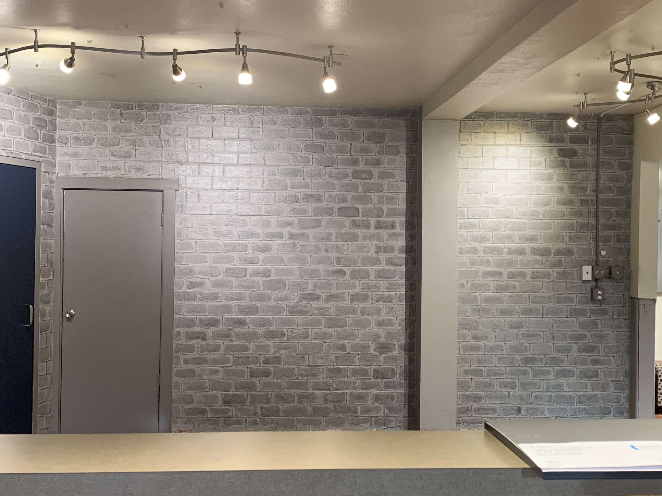
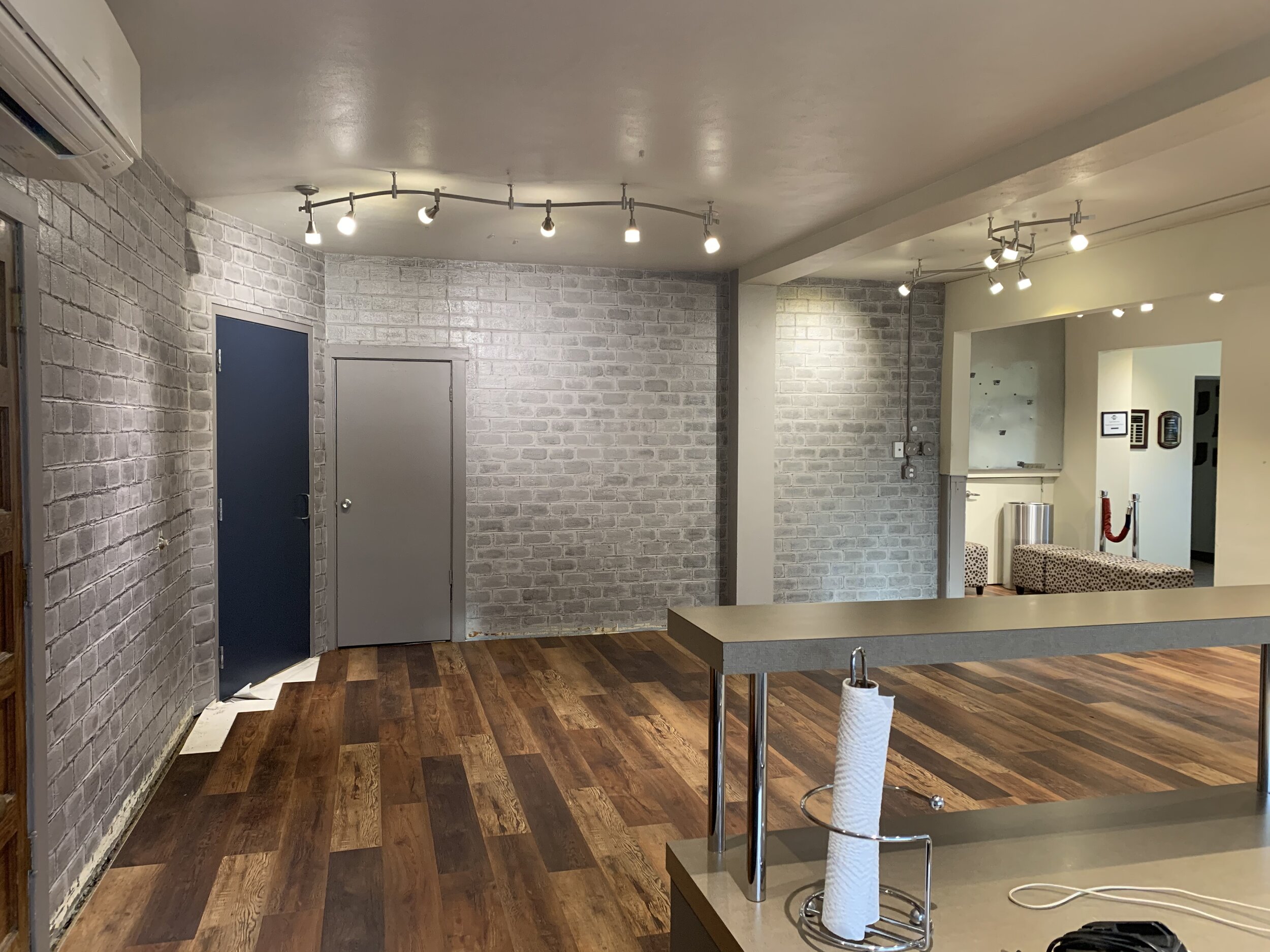
I met Dona and Marcia at the theater in late February. It had been nearly a year since I had last stepped through those doors. A beautiful new floor had been laid across the span of the lobby, and its rich wood aesthetic instantly elevated the atmosphere of the place. Hints of gray stretched along the concrete block of the walls, a glimpse of the transformational shift to come. The space had opened, wall to wall, and it felt full of possibilities.
We ascended a squeaking staircase to the meeting room, where Marcia had hundreds of photos ready to go. I was stunned by the breadth and detail of the history before me. There were large, hand-bound portfolios of original playbills dating back to their very first production in 1955. Spiral-bound books of the theater’s history lay sprawled with envelopes of photographs from every decade. Marcia had written the history books herself, and faithfully kept these archives for years. Every renovation, each space they had moved in and out of...it was all there. I listened as she guided me through the history, her smile beaming beneath a soft cloud of white hair. Marcia was in every stage of these photos, and I was astonished by how I could see entire lifetimes grow and pass through the pages of this theater’s history. This place was its members, through and through. But, I thought--how could I unify all of this in a single painting?


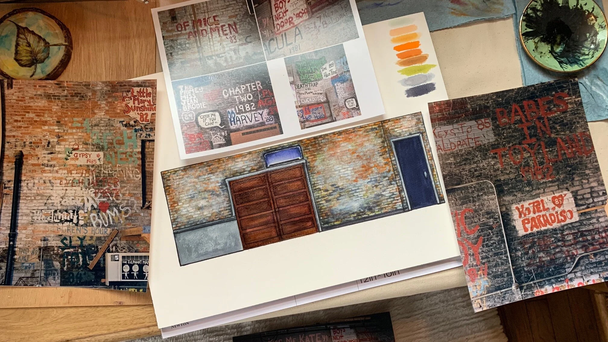
Dona and Marcia supported me through my uncertainty with ultimate confidence, and I truly appreciated their faith in the process. We looked through more images together. Dona shared a series of large, high quality photographs focused on the heavily painted backstage wall from their former space at the Memorial Opera House. She was thinking that this might be a possible way to represent the history, with the idea of the brick wall in mind. Then, it clicked. Here was an optimal way to work with the existing concrete block of the lobby walls and showcase the history--in building layers from the idea of painted, aging brick. Conceptually, this direction freed me from the confines of a timeline, and allowed my own artistic license to lean into the rustic industrial feel of the new lobby design.
Suddenly, I began to see it. Iconic imagery from playbills began to spring forward, distinctive lettering from various decades, the engaging silhouettes of people who dedicated years to this place. Through this brick-wall concept, I could play in the world of graffiti, and the architecture of a beloved backstage space animated by years of shared experience.

My first sketch of the mural design, rendered in pen
Sketching it out
After a couple of meetings at the theater with Marcia and Dona, I had all the photos and information I would ever need. I began the long and meticulous process of research, consolidating ideas and images. Dona had mentioned that it was important to include the major places where they had produced shows over the years, which provided a kind of anchor in the visuals of the design. I decided to order them chronologically from left to right, though this arc would be general and not too strict.
In the following photo gallery, the archives and the elements of the mural are coordinated. Every visual aspect of my design was informed by research and original photos of the theater’s history.


The Rendering: Experiments in Color
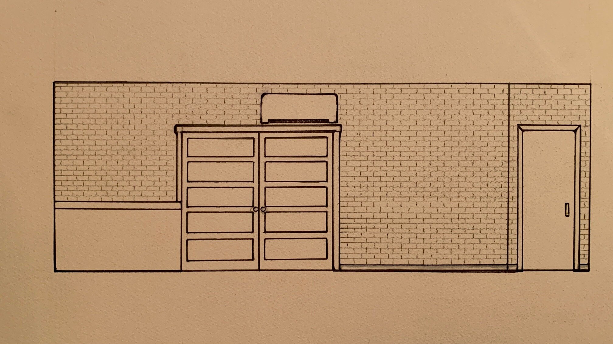
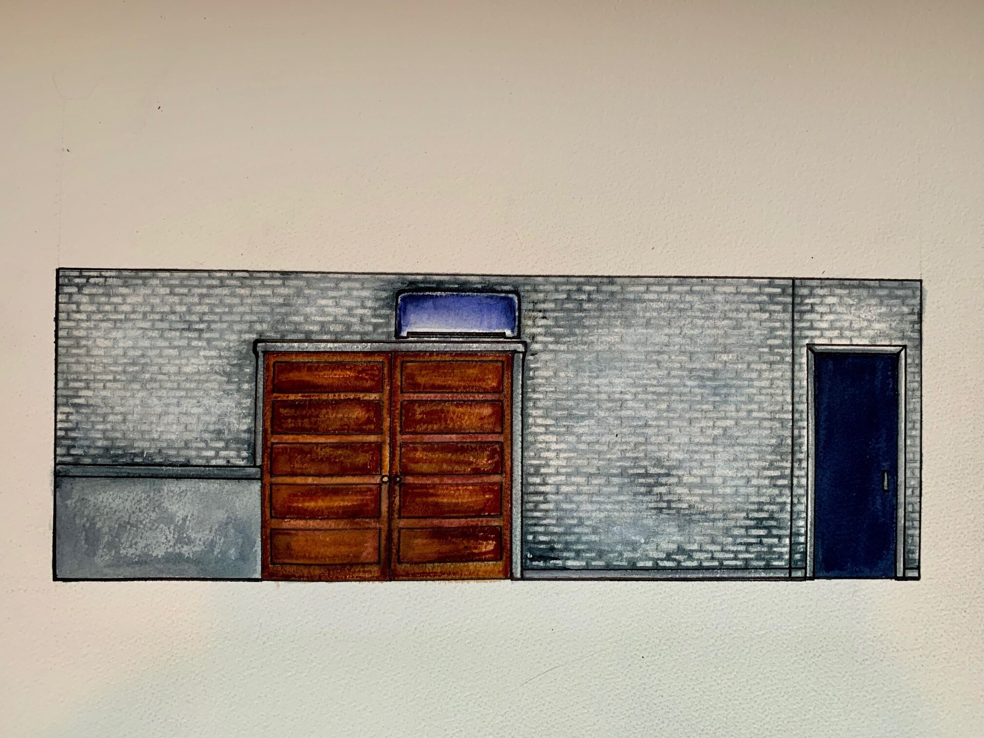
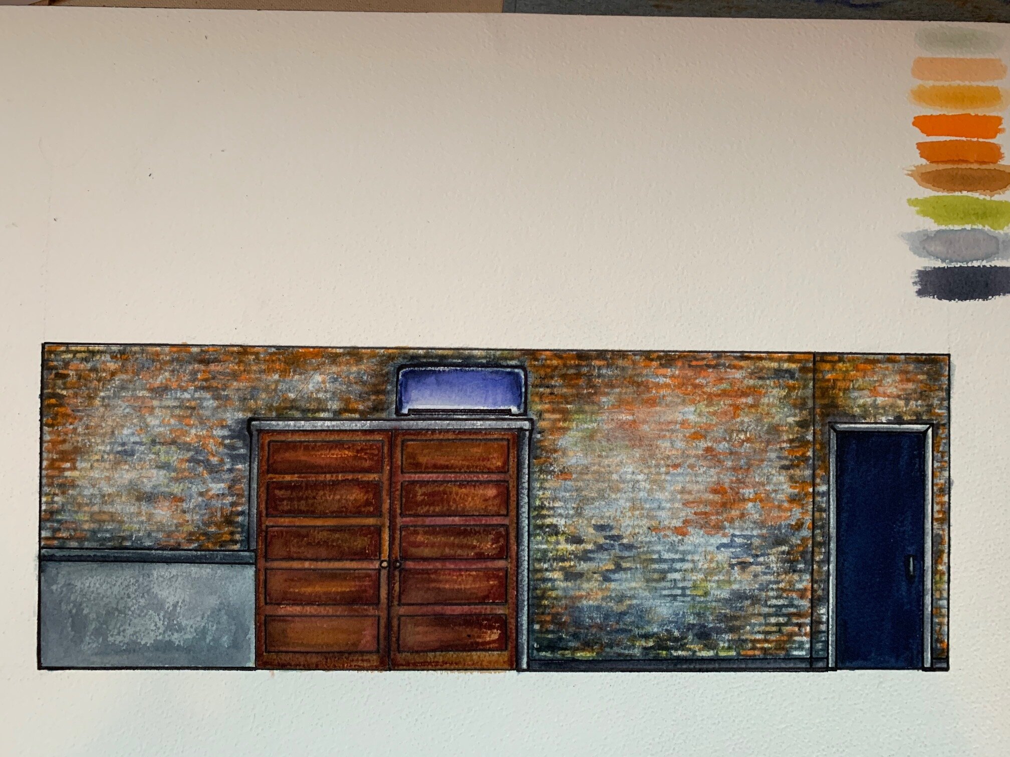
To spatially balance the level of detail required, I organized the painting process into three major layers. The first would be the brick: laying in linework, color, and glazing to create the feel of the historic backstage wall in a scale proportionate to the concrete block. I decided I would work with the existing grout lines and architecture, to enhance what was already there. One of the first examples of this was my choice to paint the large, obtrusive AC unit as the blue awning from CTG’s Alley Studio. I also thought it would be fun to transform some architectural elements of the lobby with a copper patina, to tie in the industrial style.
The second layer would be the underpainting of the major visual icons, the places and prominent logos marking the history. I used opaque acrylic ink for much of this phase. The final layer would be the color work, and contrasting black and white enamel paint over the ink. The final details of text and graphics were completed in this last stage.
Below is a photo gallery of my color rendering, hand drafted and then painted with ink, gouache, and watercolor:

I sent my color rendering to Dona, and she loved it! In response, she asked if I would be able to paint the adjacent wall with the same brick treatment, to help the space flow together. I reviewed the size of this extension, updated my rate and time estimate, and confirmed that I’d be able to include the additional wall. This nearly doubled the scale of the project. But, there was enough time available, and I agreed that it felt like the right thing to do to really connect and complete the lobby remodel.

The first step of the process: Vine Charcoal Brick Lines
The Paint Begins
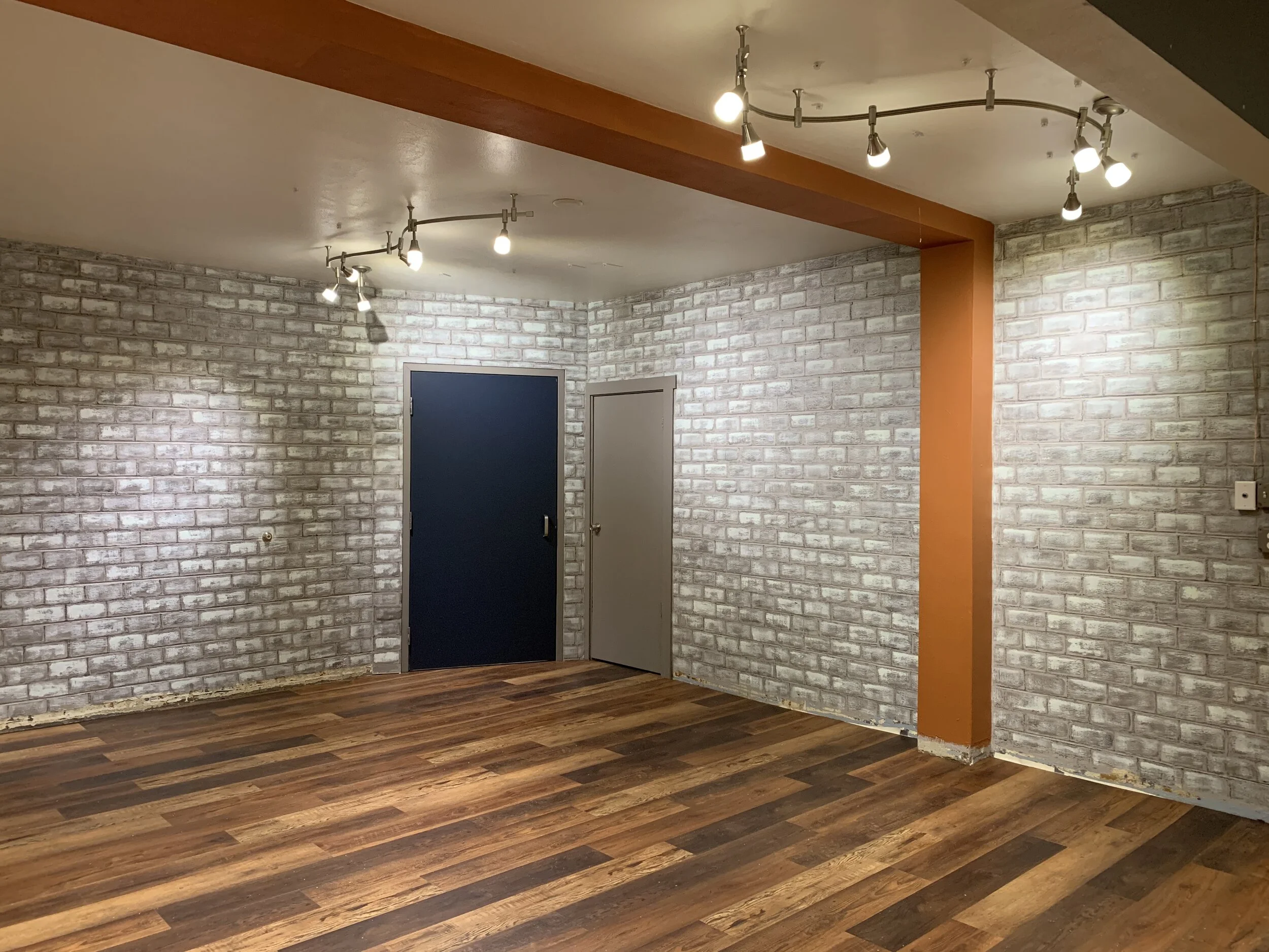
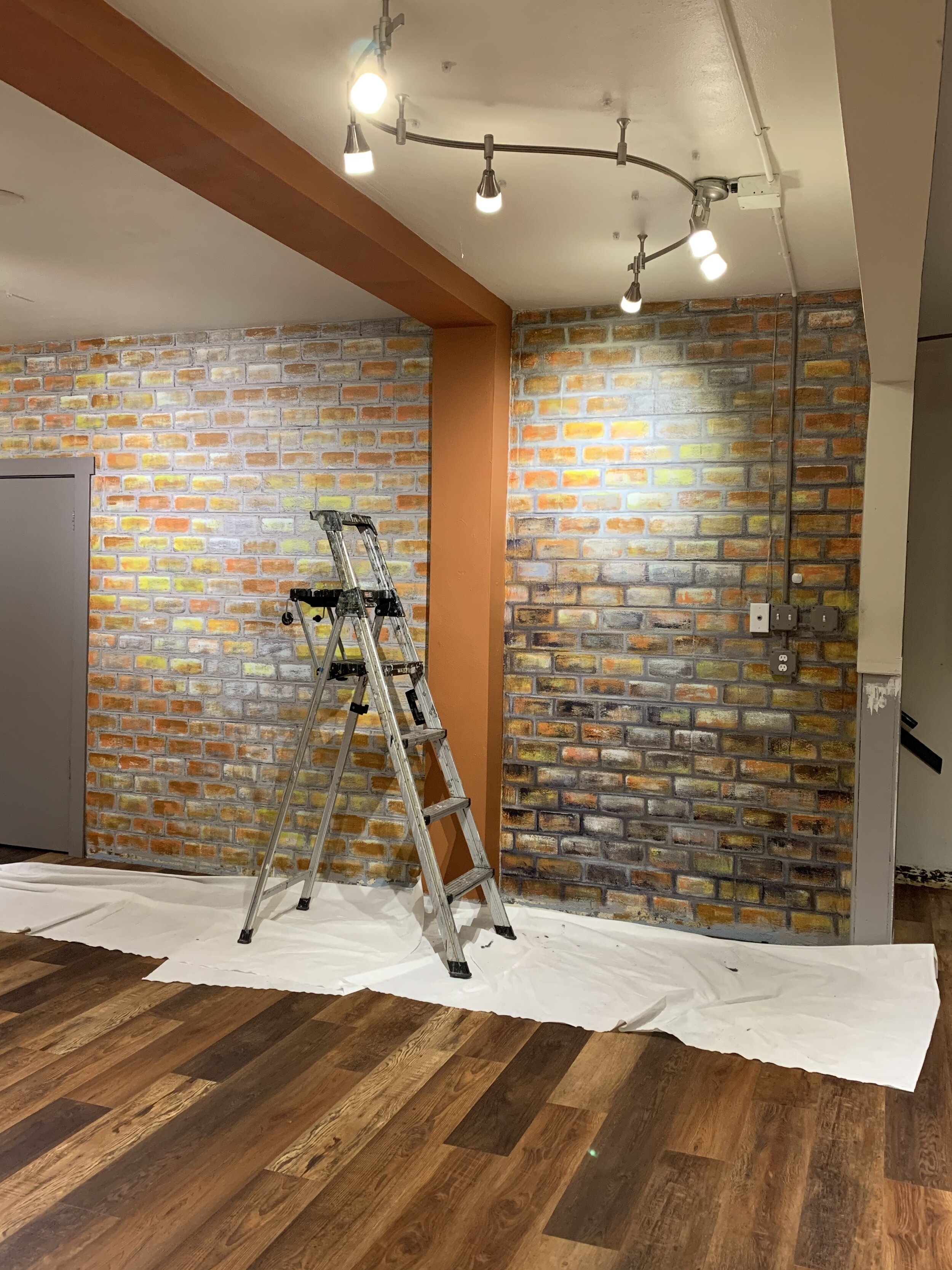
With a solid idea on paper and a plan in place, I was ready to begin painting in the space. I organized all of my materials, made a shopping run to Menards, set up the drop cloths, and went to work. After base coating the gray color, my very first day was spent mapping and cartooning the brick lines across the walls. I used a tape measure and vine charcoal to mark and lay everything in. The grout lines gave me enough of a grid to reference, and helped guide the proportion of the brick to work within the existing block. These lobby walls had been painted many times, and had a natural texture that I found to be helpful in later stages of the brick painting.
A fun warning to other painters: the lines of the concrete block are not always straight. And, the plane of the walls themselves are never perfectly straight. Unlike construction, with paint it’s imperative to trust your eye before your measurements. I stepped back frequently and adjusted my marks as I went, to make sure that the bricks appeared as level as possible.

Marking out the bricks in proportion to the cement block, using vine charcoal and a tape measure
From there, I used a very diluted glaze of black breakthrough in satin polycrylic to ghost in the brick. A wide, soft brush became an excellent tool for this. If there were drips, I was able to work them in subtly to add dimension and the illusion of descending water stains.


After a couple of passes with the diluted black glaze, I worked a stiff-bristled brush in a scraping motion across the center to lift the depth and add texture. Flat, light gray was my color of choice for this step. I also took the time to paint the large beam and elbow pipes with an orange base coat, the first step of the copper patina process.


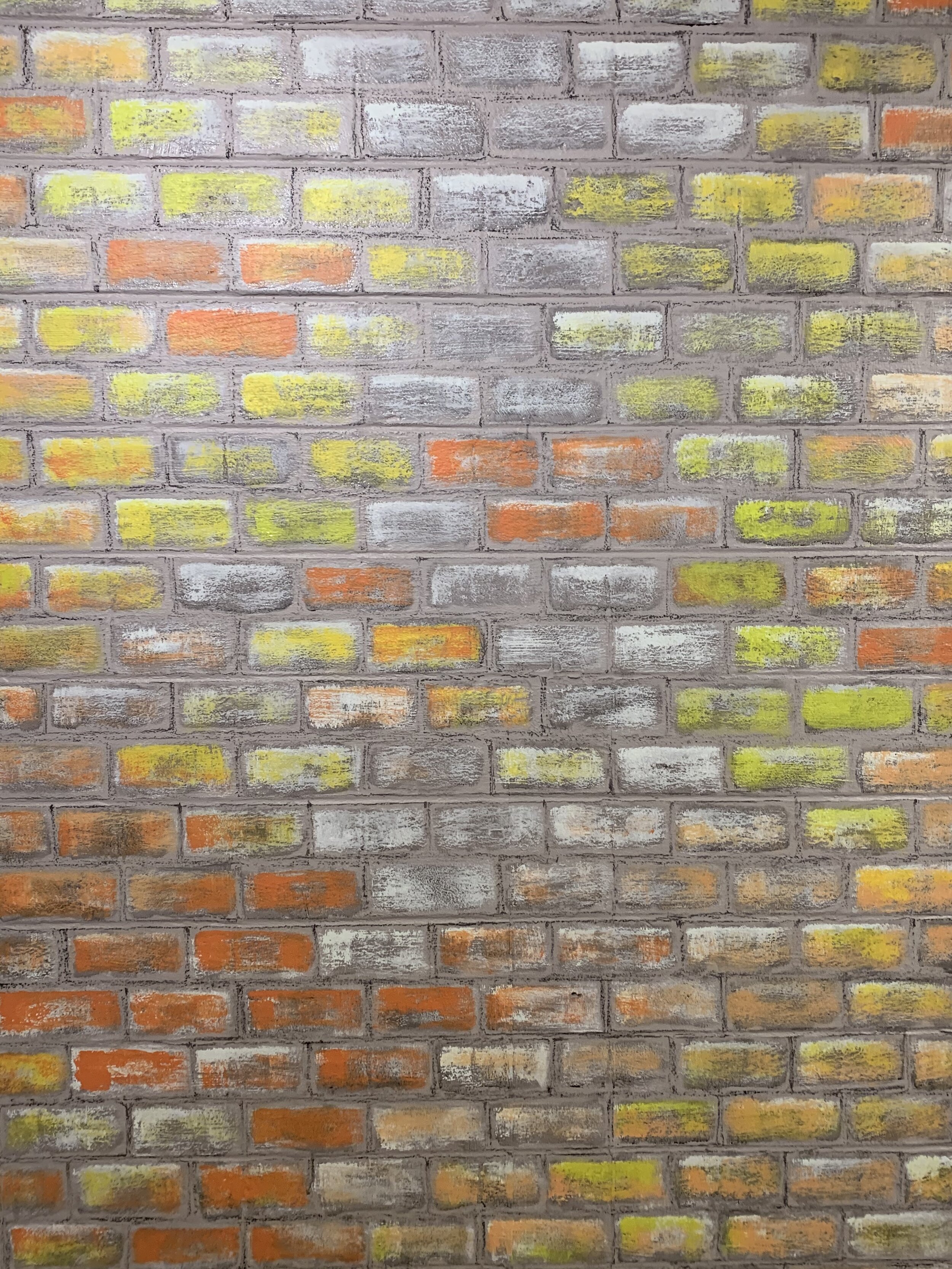
Once the gray underpainting was in, I was able to move forward into color work. This was, in all honesty, a bit overwhelming at times. While I loved my palette and knew it would get there eventually, there were phases of this that resembled the color of acid-splashed Easter eggs. My instincts knew that I needed this bold color to build off of, but it’s admittedly kind of jarring to those who aren’t familiar with the diverse phases of painting. I had to go bright before I could go dark. Ultimately, it worked, but took a fair amount of time and perseverance to achieve.


As I developed the brick patina, I felt myself becoming highly focused on the realism of it. I kept studying the original photos of the backstage wall and attempting to replicate what I saw. Aware that this was a mural people would interact with and see up close, I wanted the brick to feel as tangible as possible. However, as I tried to move forward, I kept feeling more stuck. What I eventually realized was that if the brick became too realistic, with clear grout lines and very specific detail, the layers on top of it wouldn’t work. The sharpness of the brick would compromise the legibility of the imagery and text.
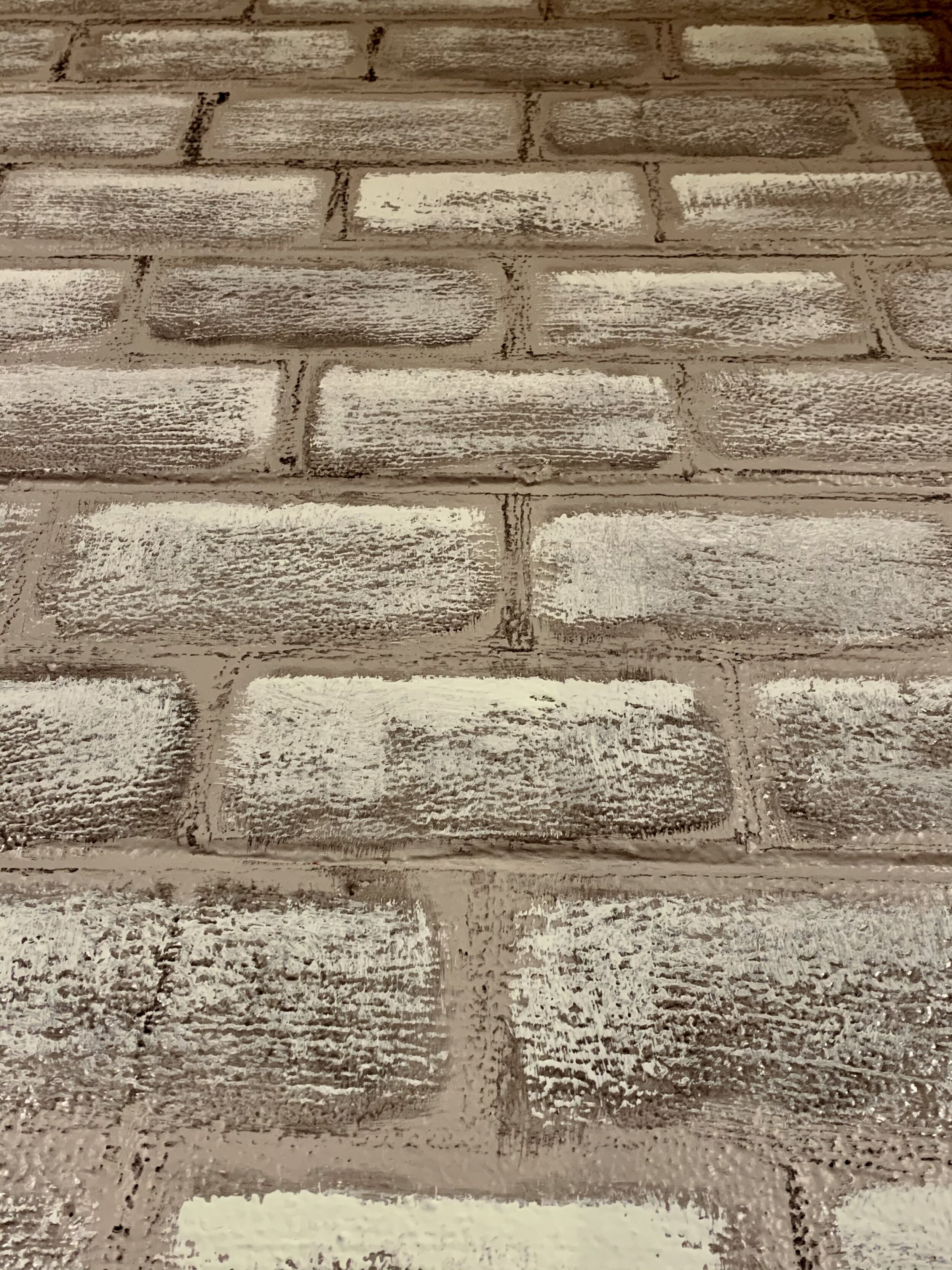
I remember contemplating this dilemma, finding a sponge roller, using a medium gray-blue color, and gently muddying the precision of the brick lines. The softening and textural blending this achieved made everything feel more believable, and created breathing space for the imagery to build upon. I went across the wall, toning down the corners and highlighting areas where the boldest imagery would live.


Finally, the brick was in! As in as it could possibly be. I spent some time toning down the flat gray trim and closet door, which brought these blank aspects into the weathered world of the walls. A thin, sepia glaze and wide angle brush was all I needed to transform the flatness of these edges.
Following this effort, I broke the ice--and began painting the images.


The Magic of Ink: Underpainting
At this phase of the process, I had more or less moved in. I had a workspace set up with my coffee pot, a crate full of research, a sketchpad, snacks, bottled water, and my brush kit. I had brought the feeling of my home studio into the space, because I knew this would help me feel supported throughout the long hours of concentration required to draw all of the imagery. One of the most helpful mediums in this stage of development was the discovery of opaque acrylic ink. The precision and fluidity this allowed over the rough surface of the wall was instrumental to the quality of the detail. Using ink in the underpainting offered a unique balance of both freedom and control, and it has effectively become on of my favorite mediums. I am in tremendous gratitude to my friend and mentor, Ann, who had sent me bottles of Daler & Rowney FW ink as a surprise gift when she saw I was doing a lot of illustration work. I had no idea at the time that her gift would become one of the best materials for this mural!
In creating the underpainting, I also used vine charcoal for registration marks, and a diluted brown glaze (acrylic paint and water-based urethane) for the more subtle values. The clarity of the ink helped me layer a crisp edge and opacity to the areas I wanted to strengthen. I went into this part of the process very aware that the margin for error was minimal. I was going to have to commit to the lines I put down, as the brick underneath would also need retouched with every back-and-forth decision layered on top of it. Vine charcoal can be nearly erased with the sweep of a hand, which is why it’s so forgiving and a great medium for layout. However, a more solid application is needed over the charcoal to lock in the line. This is where inks and glazes really shine. The process of painting this was fairly similar to watercolor, where every mark and color on the page remains there to be worked with, and not erased. Incorporating the aesthetic of an aged brick wall layered in a history of colors was an element of the design that allowed me to make any “mistakes” a part of the story.


Finding the Story: The Meaning in the Mural
I spent a lot of time with the history as I developed ideas for this mural. At the quintessence, I was aiming to tell the story of this place through paint. It was critical to me to create something that felt like it belonged to the people who made Chicago Street Theatre into the vast community it has become. There are deep roots to this company, and many evolutions throughout the years of its past.
Here is a breakdown of the imagery and how I arrived at each moment, from the beginning to the present:
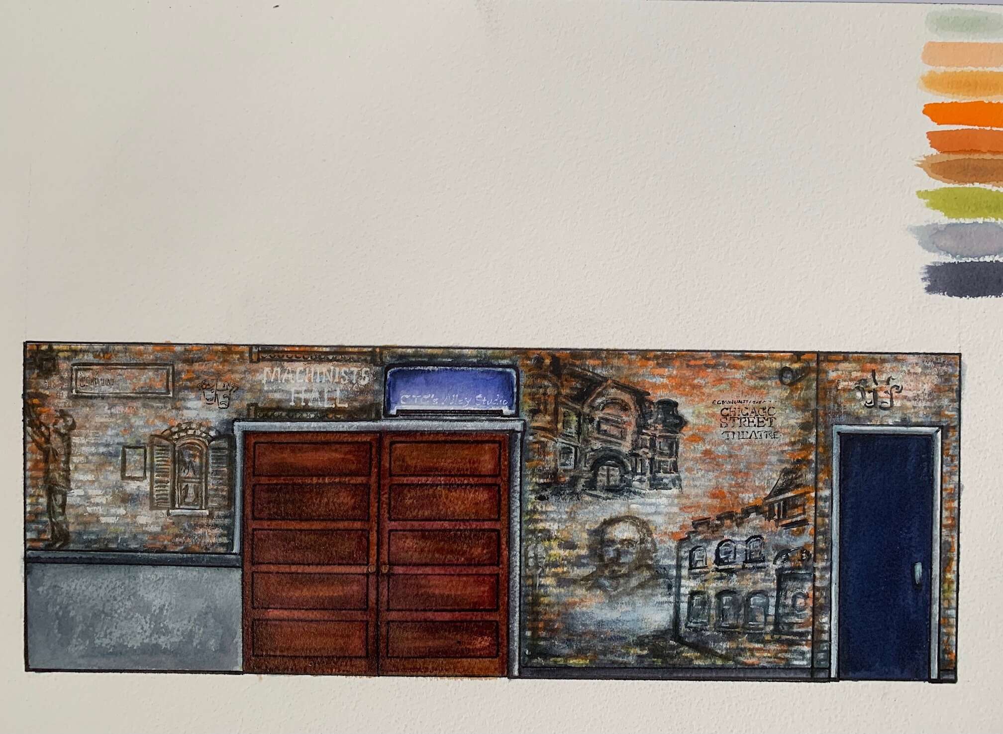
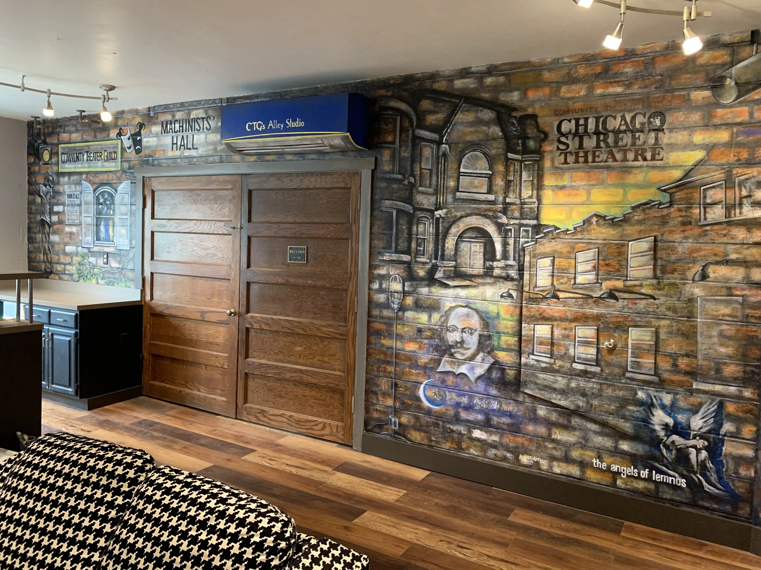
The Left Section of the Chicago Street Theatre Mural (Lobby)
Left Section (Origins)
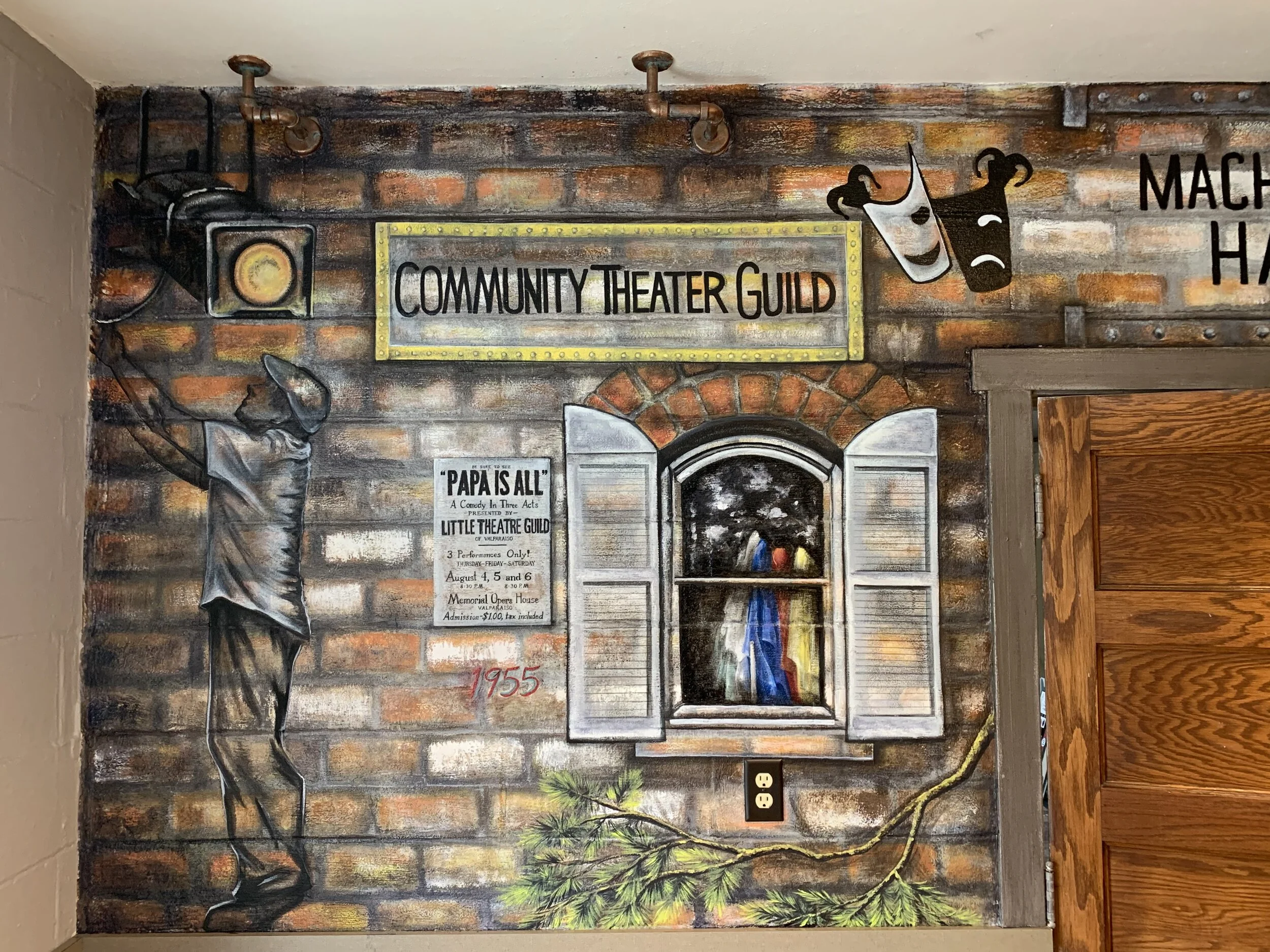
1955: This is the first year of the very first production--the date is painted just below the playbill of their first show, ‘Papa Is All.’
“Papa Is All” Playbill: The first production came from a community effort to raise money for the band uniforms at Benjamin Franklin School, in Valparaiso, Indiana. Their chosen play was ‘Papa Is All,’ and they have the original playbill in the archival portfolio. They called themselves the “Little Theatre Guild” at first. I painted this directly from the original playbill.
“Community Theater Guild” Sign: Within a couple of years, the Little Theatre Guild realized that interest in the theater extended far beyond Valparaiso. They named themselves the Community Theatre Guild, and the details of this sign are pulled from photos throughout their history.
Original Logo: This was painted from their earliest logo, featuring the iconic tragedy/comedy masks
Rosemary’s Window and Evergreen Branch: For years, the Community Theatre Guild stored their many costumes and props in an old brick house they called “Rosemary’s place,” tucked deep into a surround of tall evergreen trees. The architectural detail that really stood out to me was the distinctive style of the curved, shuttered windows. My favorite moment of those photos was one where you could see costume racks through the heavy glass. Wild, swooping pine branches encased this place, and added to its character. The evergreen is also a symbolic tree, representing the persistence and renewal of this company.
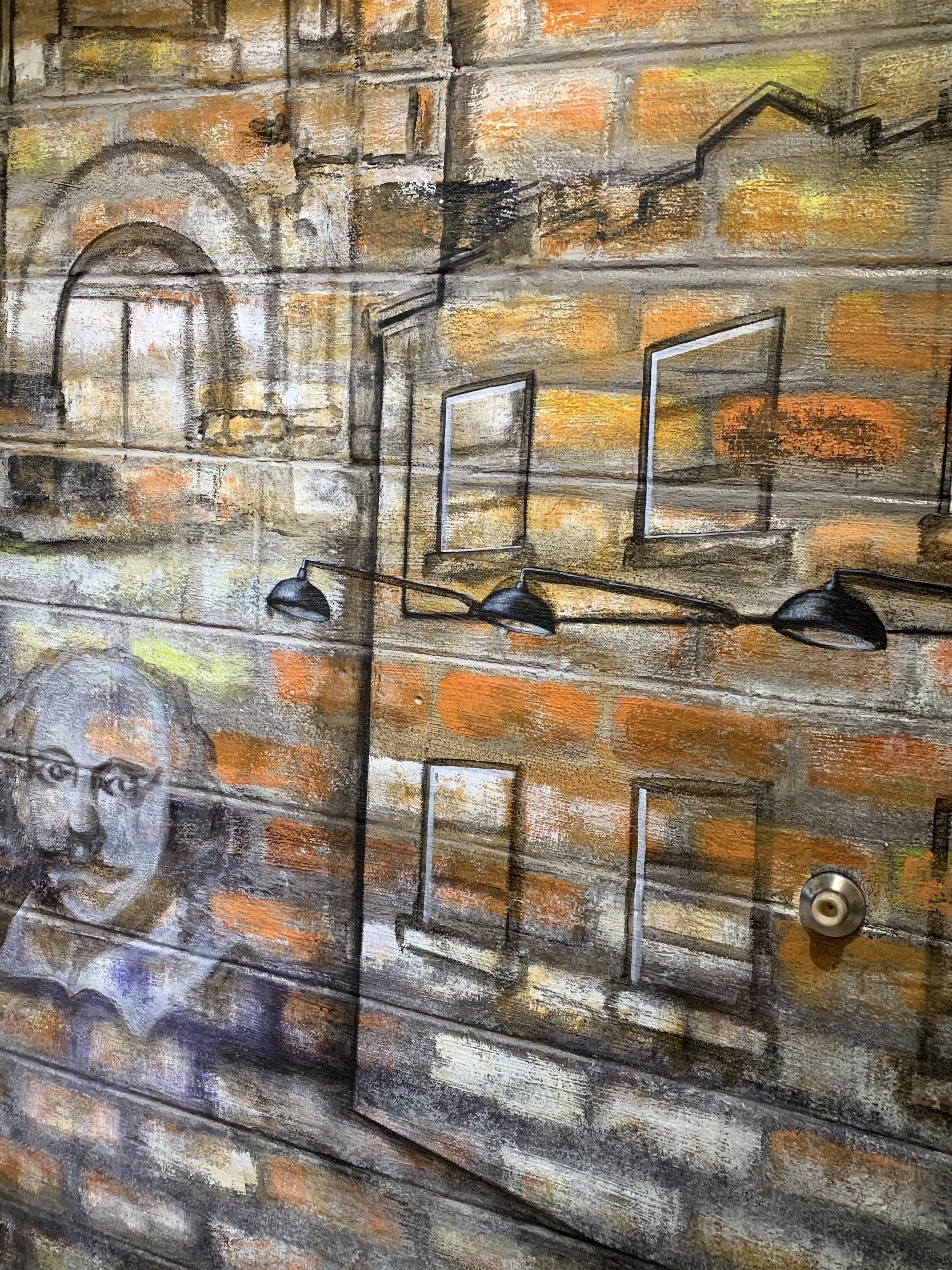
Stage Lights (Left and Right Ends of Mural): I found several photos of theater members working on hanging the lighting rigs, and wanted to include this equipment as a part of the history. There are two stage lights in the mural, and each points towards a sign and company name that was a significant part of the theater’s identity in the past.
“Mel”: There is a figure in profile, beneath the stage light at the left extreme of the mural. This figure was inspired by a remarkable individual named Mel, who quite literally built the theater into what it has become. He worked on every set, every major renovation, and essentially managed the needs of the building for years. Their shop is dedicated in his name, dating back to 1962. Mel represents the legacy of individuals who have dedicated a lifetime to this theater, and the broader spirit of those who make all the magic happen behind the scenes.


The section above the shop doors, Chicago Street Theatre Mural (Lobby)
Above the Shop Doors (Transitions)
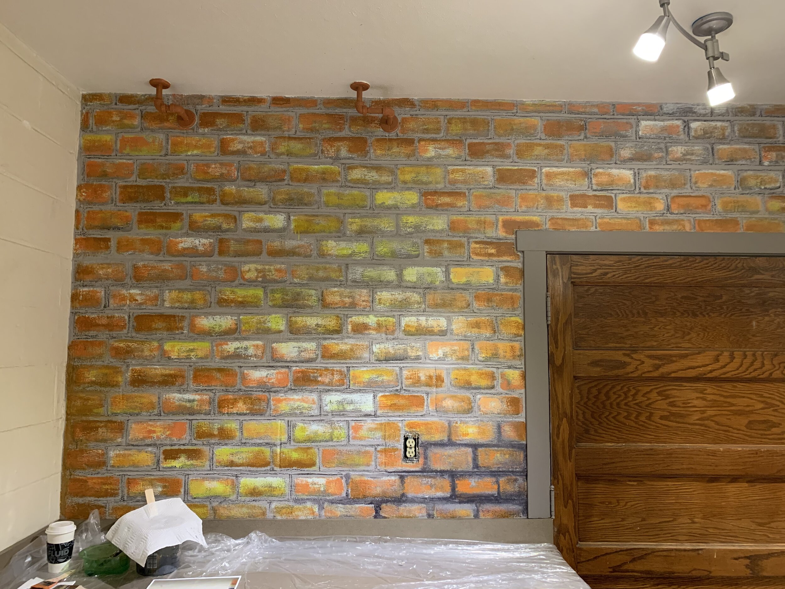
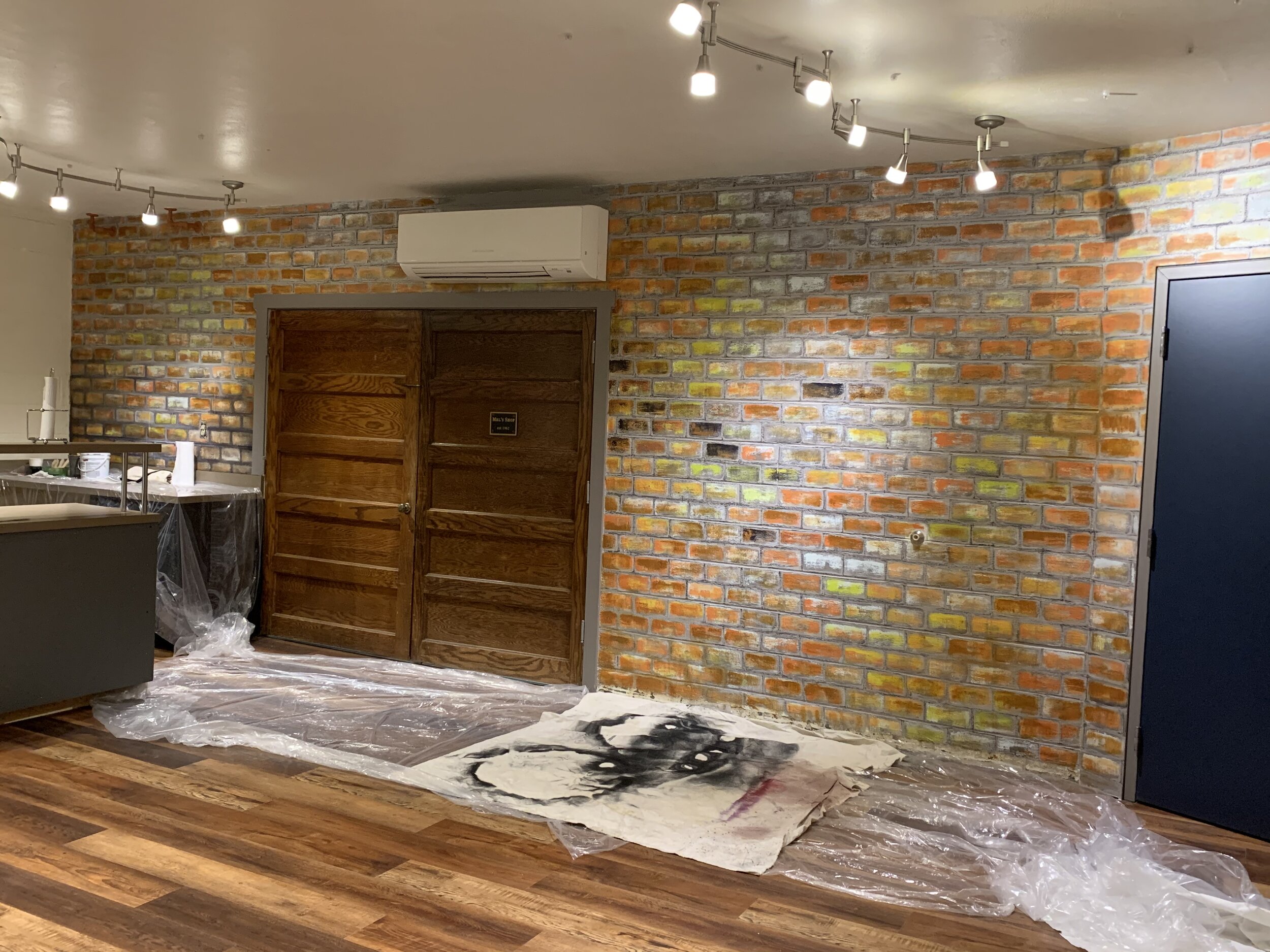
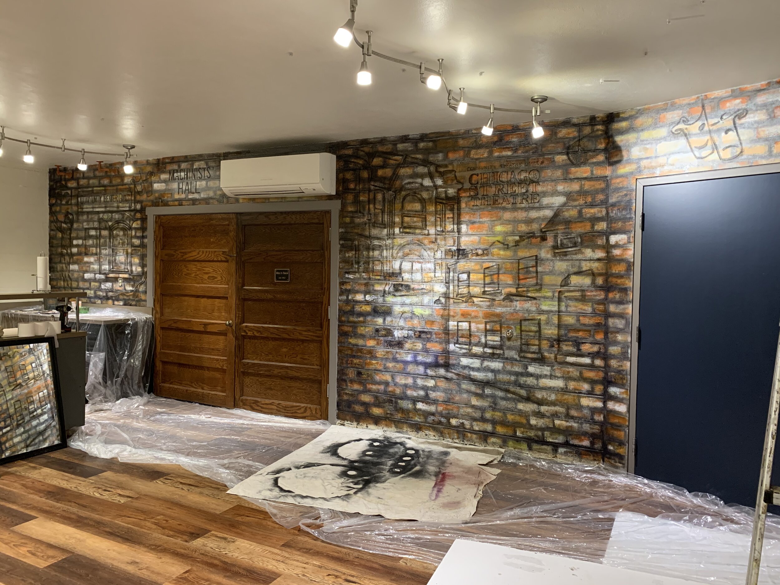
“Machinists’ Hall”: The first of the two titles above the shop doors cites a place called ‘Machinists Hall,’ which was an open space with I-Beams that the company had rented to produce shows. I represented this moment in their history with industrial text and a riveted border inspired by the I-Beams.
“CTG’s Alley Studio:” This is an AC Unit. And I was searching for a way to work with it. Fortunately, research provided an excellent solution. A transitional time in the company’s history led them to a place they called the Alley Studio, located on the backside of the building that now houses Blackbird Cafe in downtown Valparaiso. They had installed a dark blue, curved awning with bright yellow text, which I worked directly from in the painting of the air conditioning unit. The exposed brick of their Alley Studio space had a light, chipped color, and I incorporated this into the paint treatment above the shop doors.


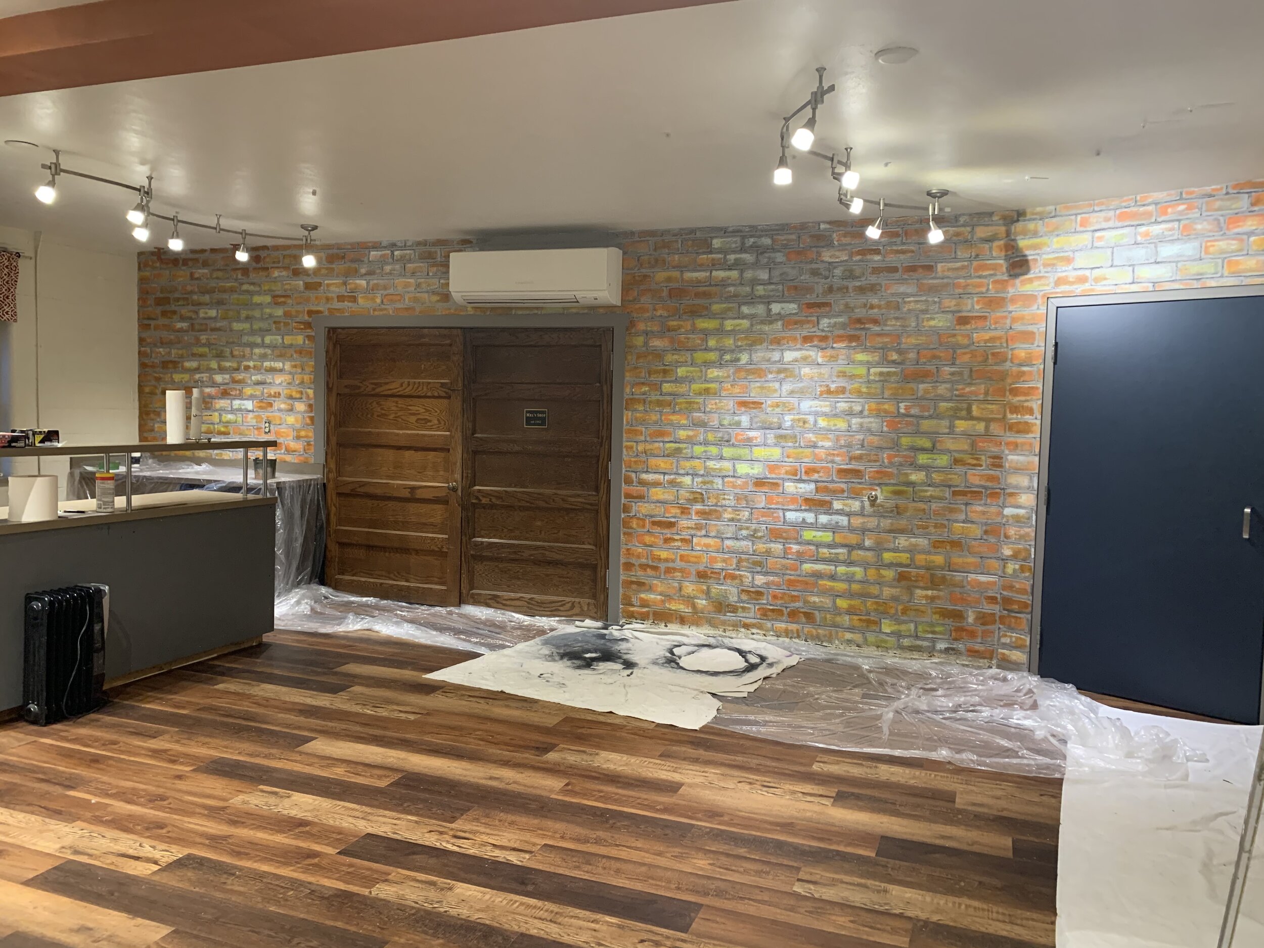
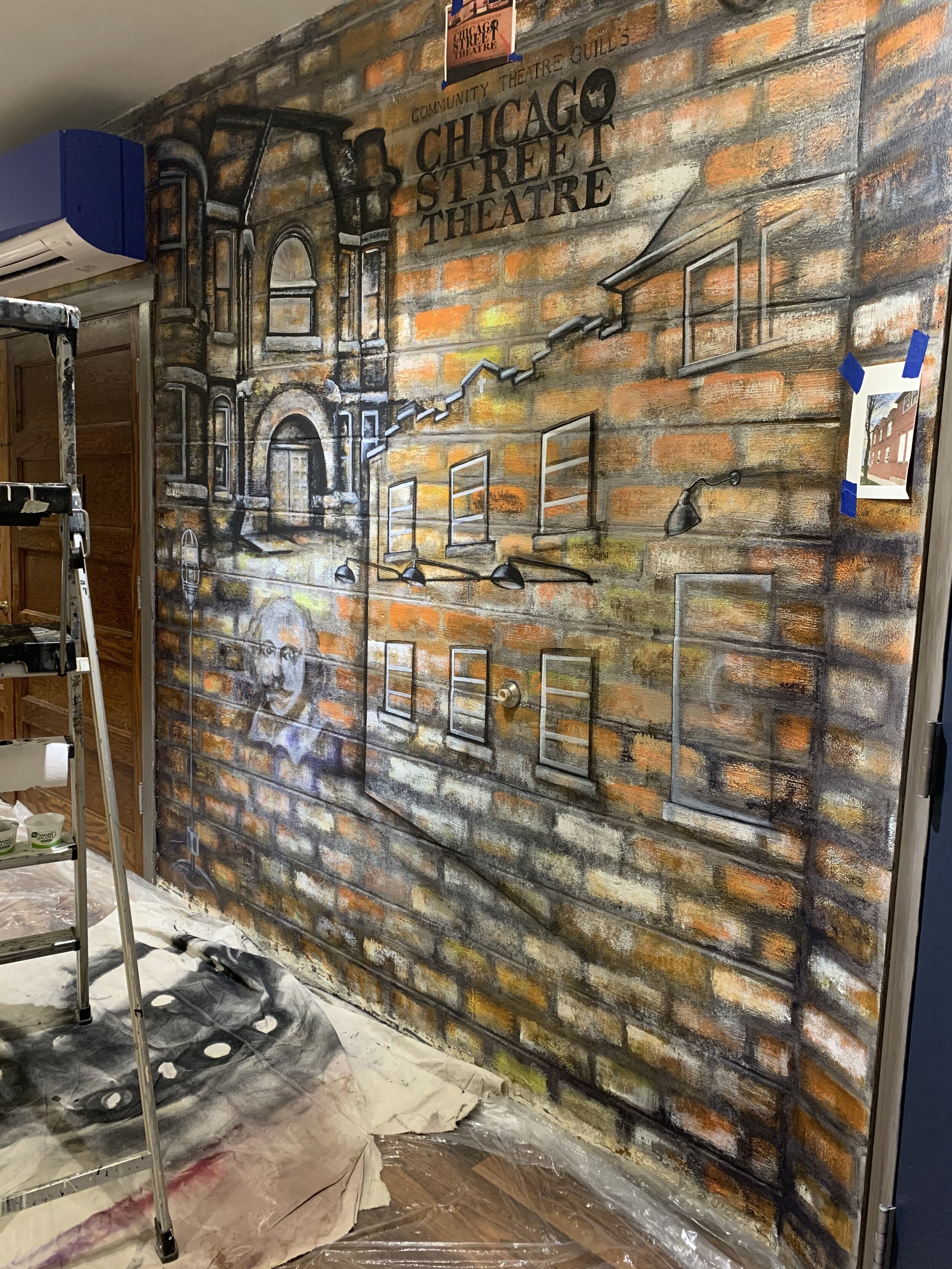
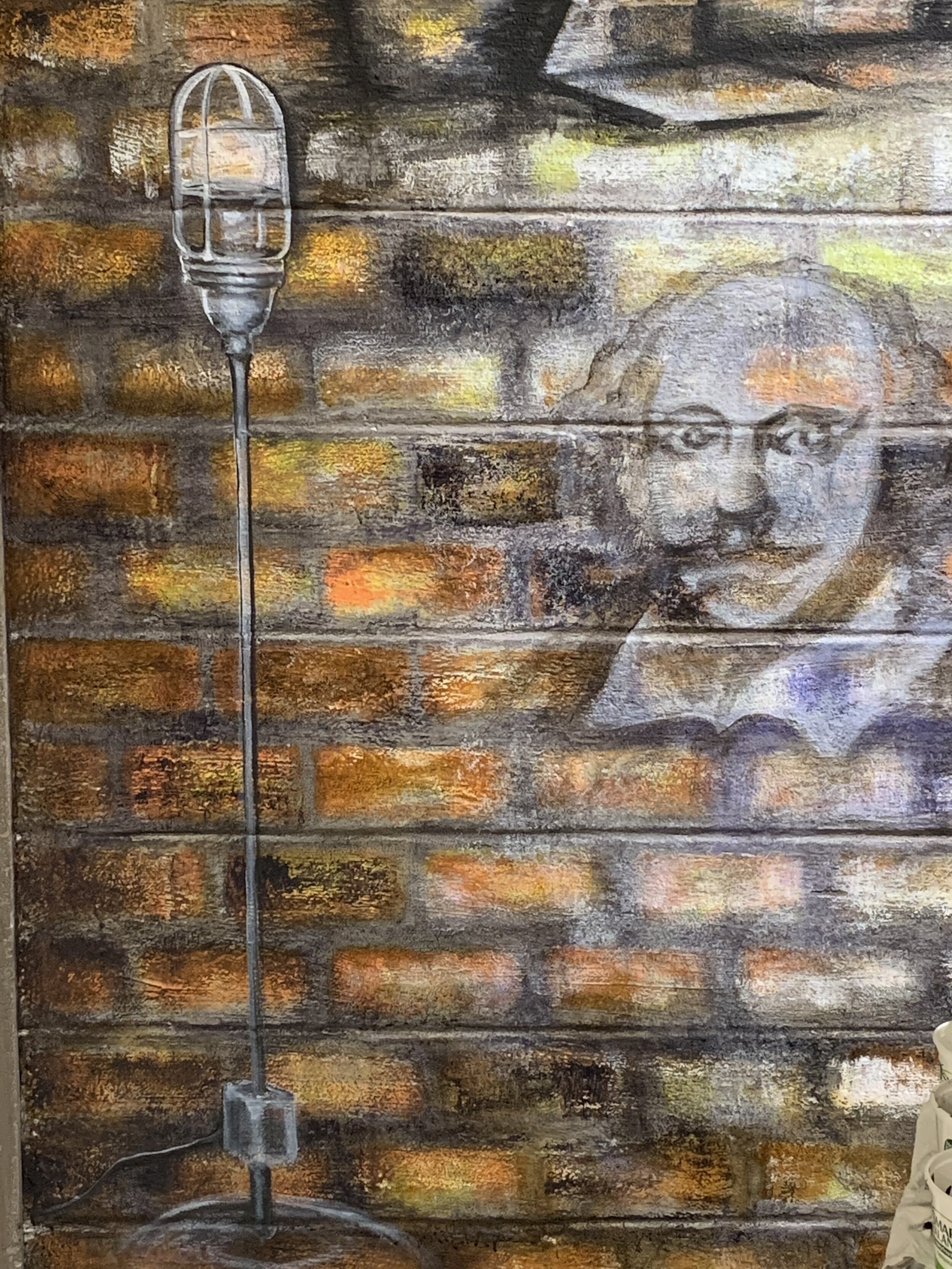
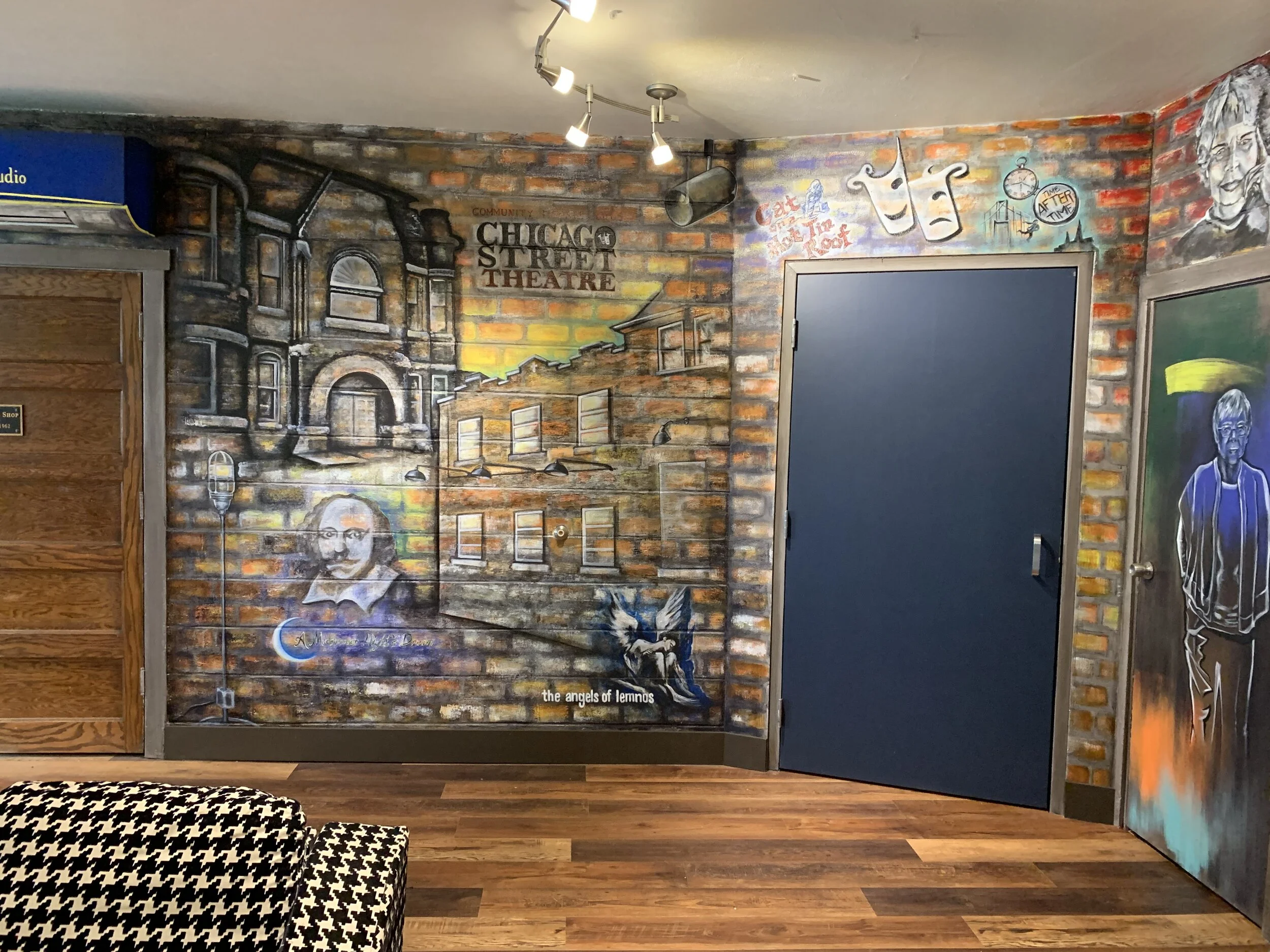
The Center Section of the Mural, Chicago Street Theatre (Lobby)
Center Wall (Two Houses)
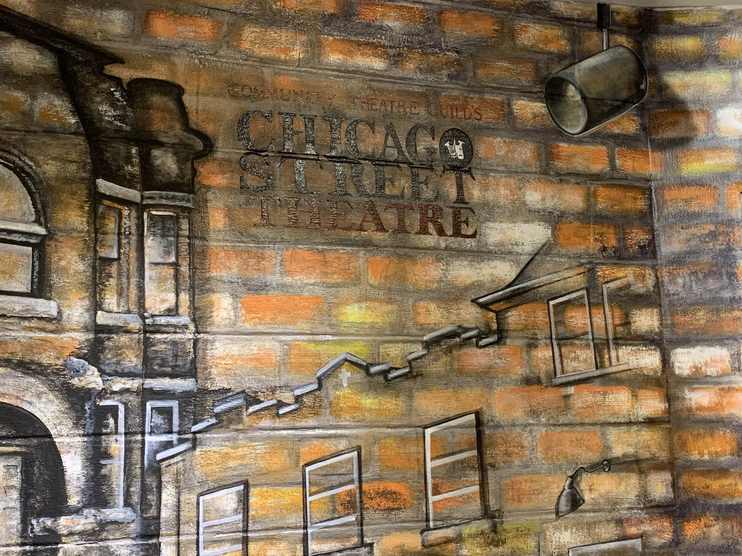
“The Memorial Opera House”: The Memorial Opera House is a unique, iconic, beautiful historic building located in downtown Valparaiso. The Community Theatre Guild produced their earliest works here, and continued to operate in this building for years. They became the beating heart of the place, creating decades of shows for the community and bringing life to the old stage. In the mid-1990s, conflict arose between the company and the county. The local government owned the building but hadn’t, at that time, cared for the parts that were deteriorating. Money was desperately needed for restoration, expenses that extended far beyond the Community Theatre Guild’s ability to cover. Negotiations around repairs and use of the facility were underway, but ultimately the issues weren’t able to be resolved and the company was forced to look for a new space.
I chose to represent the Opera House in perspective, and worked from an image in the history book written by Marcia. I made the choice to use gray tones and fade the architecture into the surrounding brick, overlapped by the brighter, current building of Chicago Street Theatre. Visually, this contrasts the past with the present. The Memorial Opera House was an integral part of their history, and should be present in the mural. In a way, representing this aspect of their history felt like restoring a sense of ownership, of the remarkable past connecting these two buildings. The overlap suggests that both houses of the theater community are strongest when standing together.
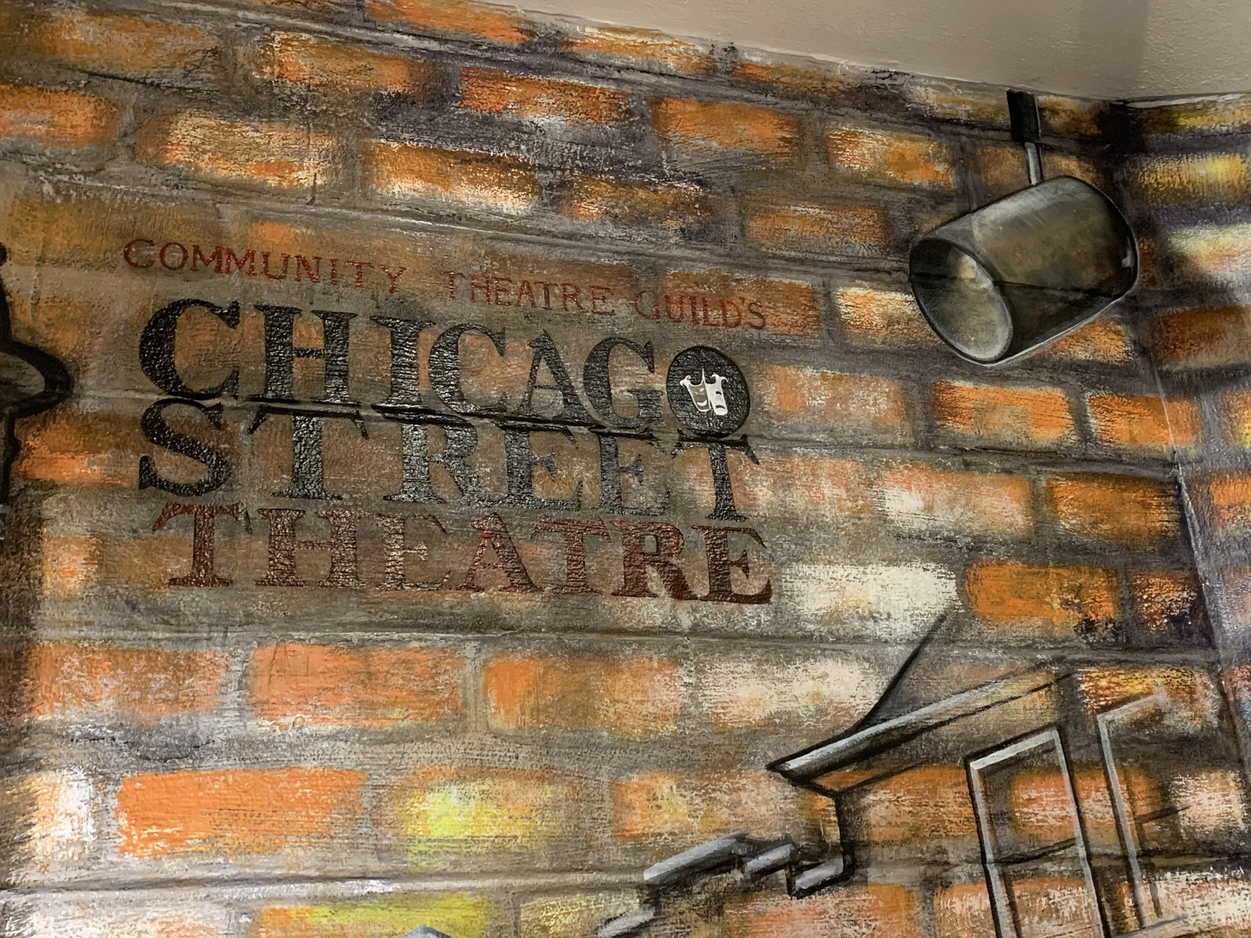
“Chicago Street Theatre”: The current building that houses Chicago Street Theatre was purchased from the Assemblies of God Church in 1997. This was the ultimate act of independence and autonomy for the company, and a declaration of creative freedom. A massive renovation effort has transformed the storied building over the years, with each space gradually adapted to support the many facets of their operation. The main stage, shop, tech booth, lobby, downstairs dressing rooms, upstairs offices, studio space, and loft storage are all aspects of the building that have supported the growth of the company. Over the years, this has become the true home of Chicago Street Theatre, and the gateway to its future.
I chose to represent Chicago Street Theatre’s current building in perspective, connected to the doorway that leads into the mainstage space. Visually, this is a transition from past to present--the design connects the building the viewer is standing in with the present energy of the show taking place inside the theater.
“Chicago Street Theatre” Logo: When the company moved into their current space in the late 1990’s, they updated their name to reflect the new location. The text painted above the Chicago Street Building was their logo for years after the big move, and read “Community Theatre Guild’s Chicago Street Theatre,” to join the company’s identity with their new home.
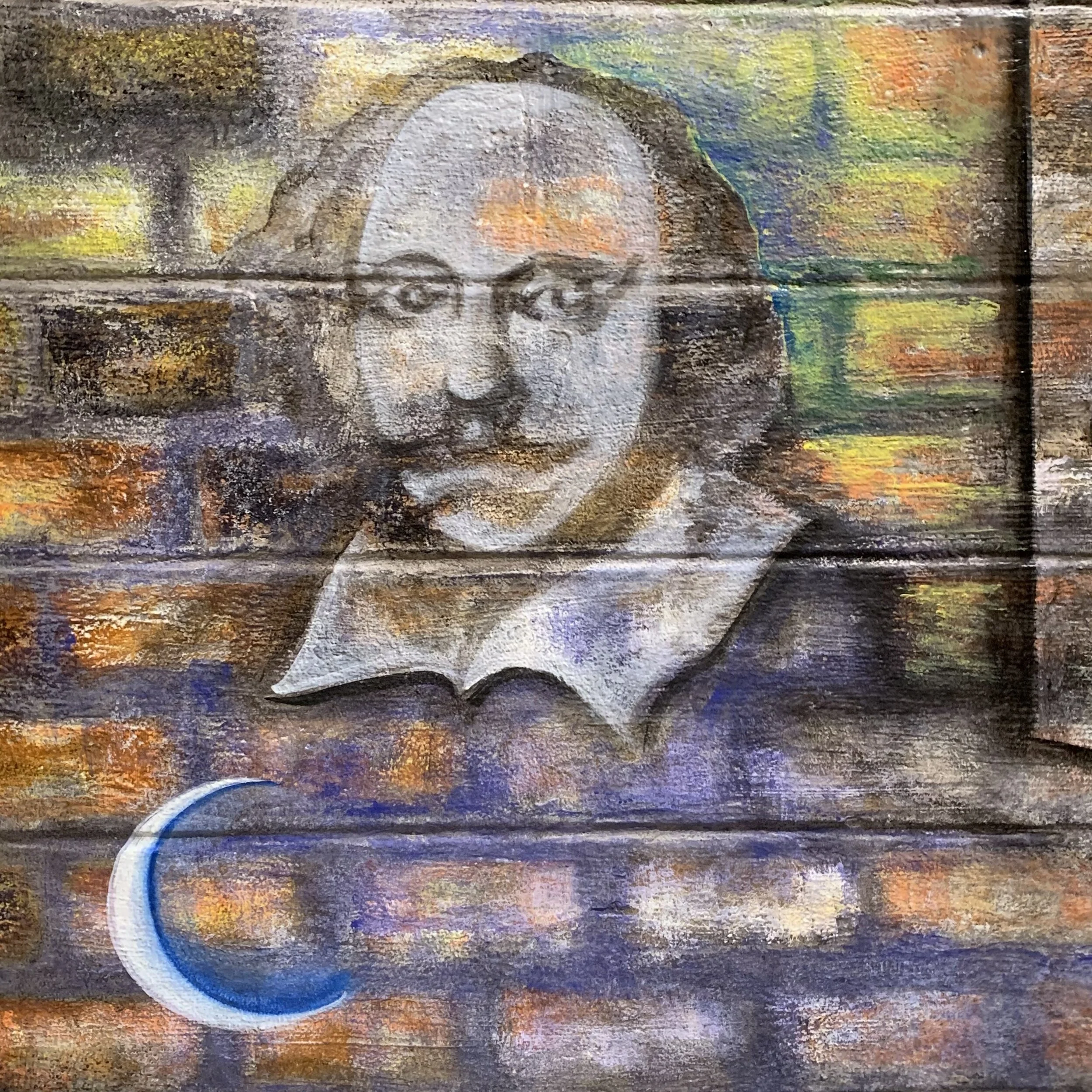
“Shakespeare”: I included a portrait of Shakespeare, to represent “Shakespeare in the Park.” In the summer of 2012, Chicago Street Theatre partnered with Valpo Parks and Recreation to produce the first-ever Shakespeare in the Park event for the community. The first production was a whimsical presentation of ‘A Midsummer Night’s Dream,’ which is commemorated in text below Shakespeare in the mural. It took place in the newly constructed Central Park Plaza on the weekend of a full moon in mid-July, and was performed to a crowd of thousands. The annual summer Shakespeare event has become a tradition ever since.
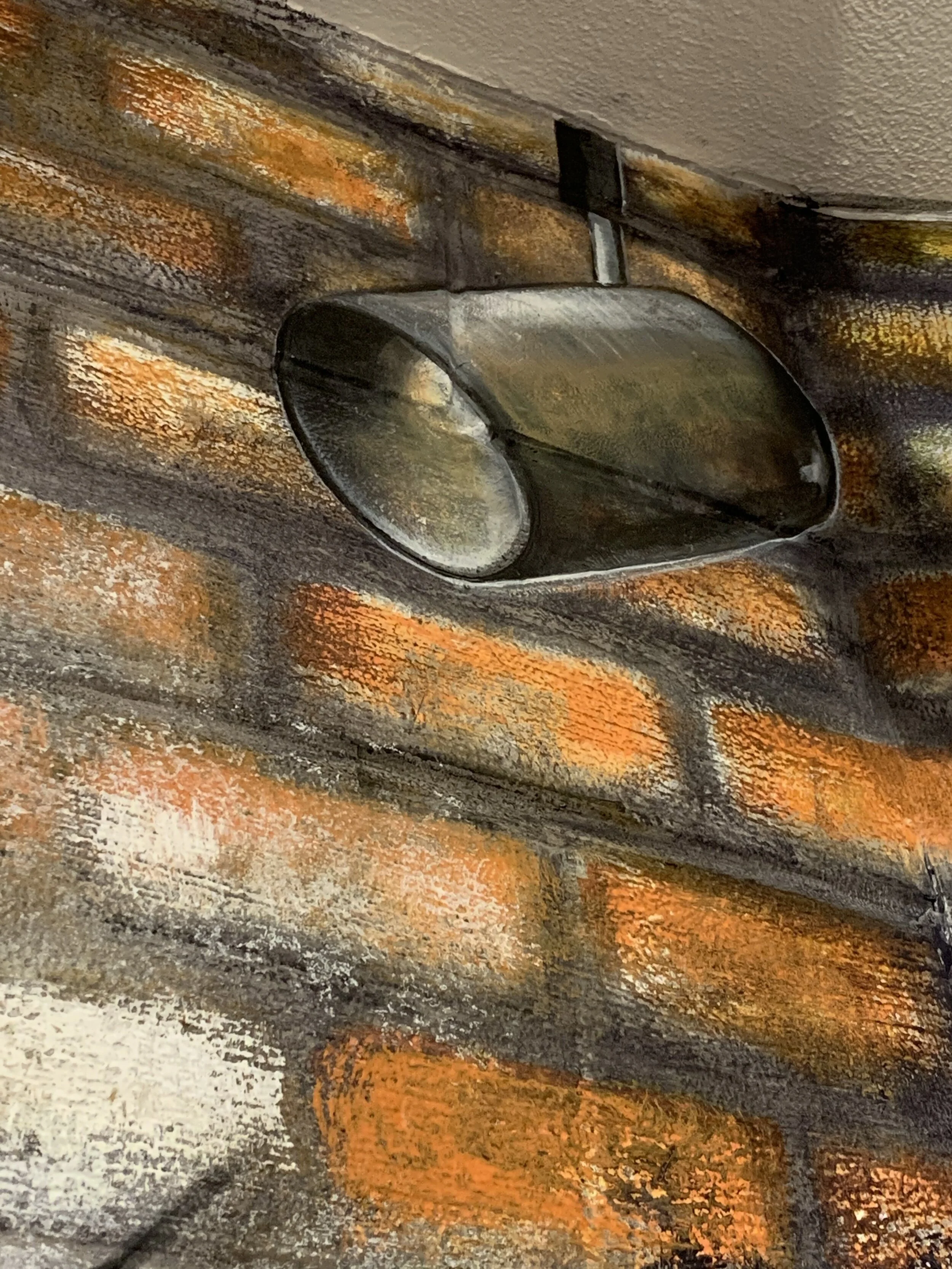
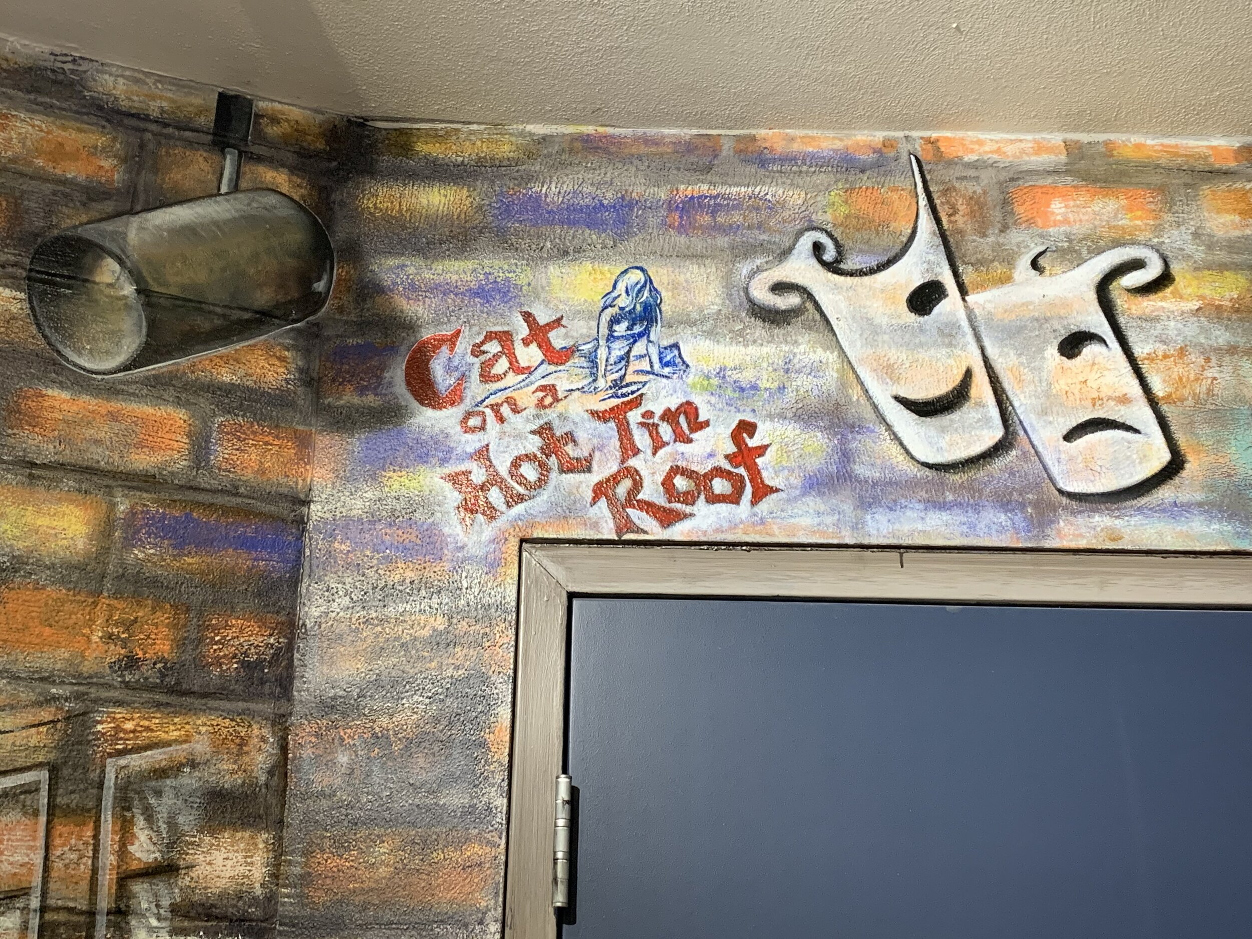
Ghost Light: The ghost light on the right side of the shop doors stands as a reminder that even when the theater is dark, there will be a return to the stage. This is a painting of the actual ghost light of Chicago Street Theatre.


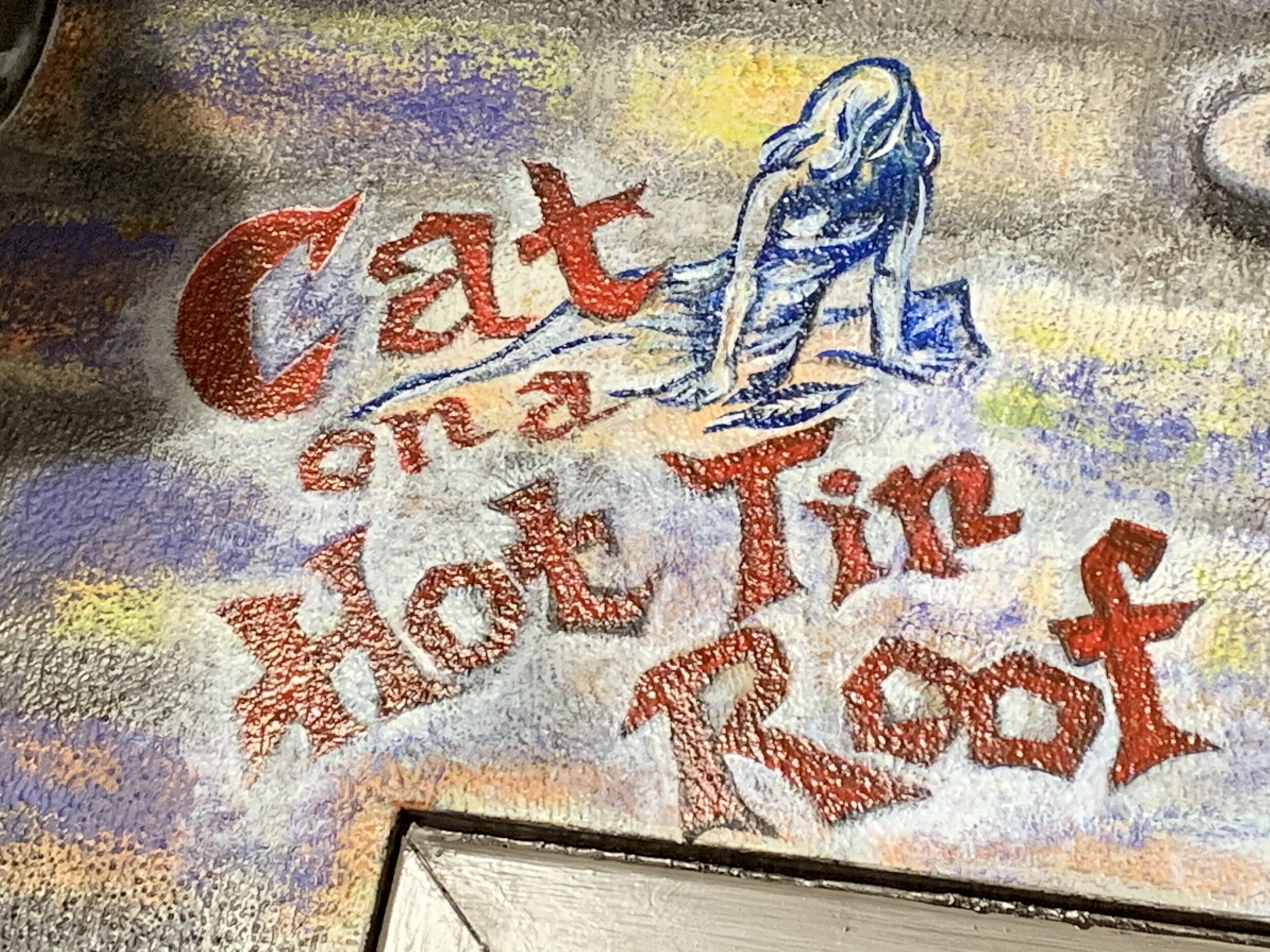
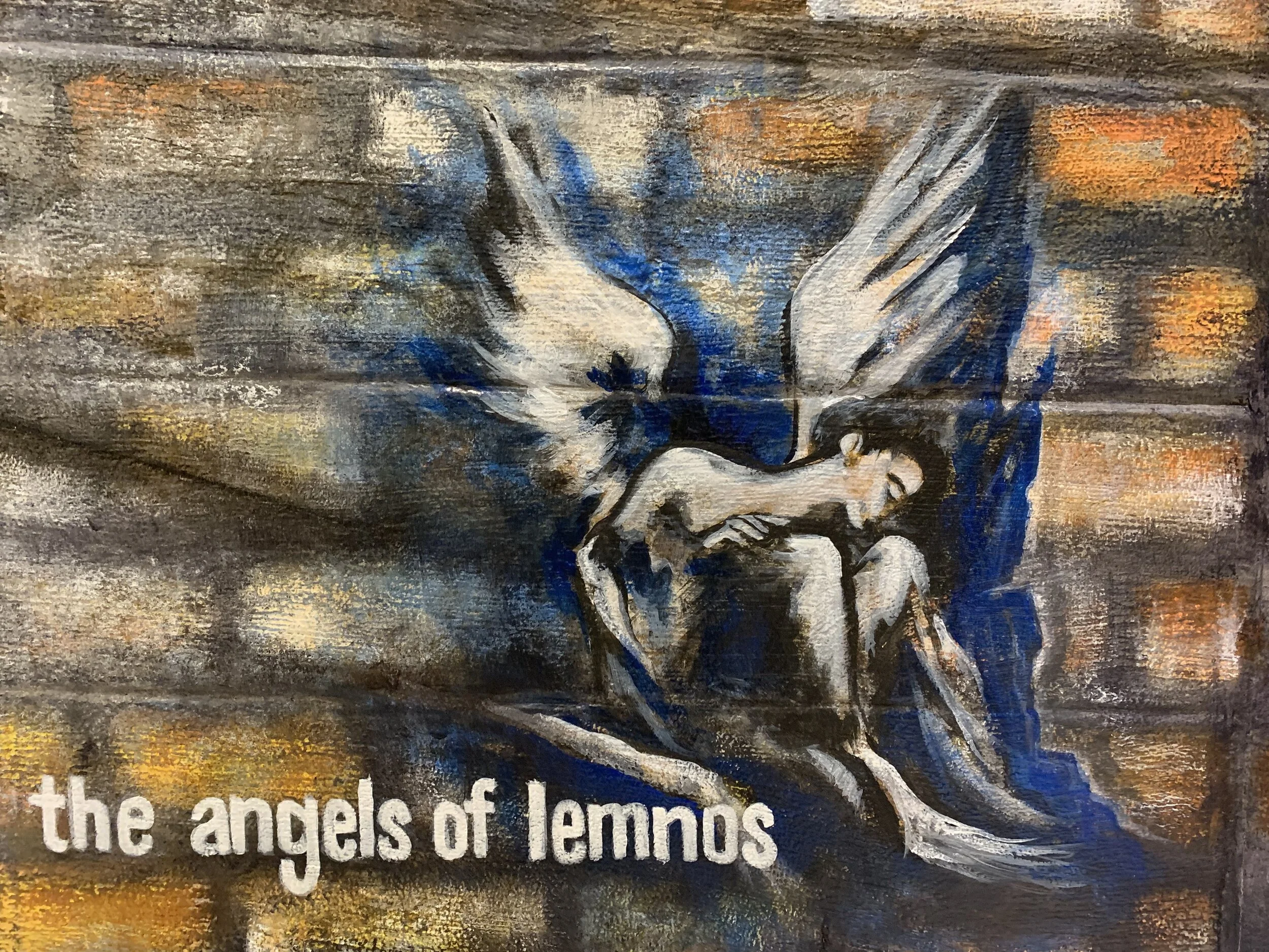
The Entrance Door to the Theater Space (Lobby)
The Doorway (Theater Entrance)
Playbills: Framing the doorway into the theater are the text and imagery from several playbills I found in the archives. “Cat on a Hot Tin Roof,” “Time After Time,” and “The Angels of Lemnos” are the featured show titles in the mural.
“The Angels of Lemnos” holds special significance, because it is an original work by playwright, actor, artist, and long-standing member Jim Henry. The artwork for the original playbill (1998) was created by Eric Brant, whose paintings and expressive style shaped the aesthetic of the company’s marketing for years. This has become one of my favorite details of the mural, because it celebrates the connectivity of theater with the support of original art.
Drama Masks: The light-colored tragedy/comedy masks above the doorway echo the ones on the exterior architecture of the building. They are a foundational icon of all shows produced in the realm of theater tradition, and crown the entrance to the stage.
The Current CST Logo: Painted on the entryway door is the current logo of Chicago Street Theatre. The dark blue surround matches the theater house wall color, and is the one aspect of the former lobby that I chose not to paint over. The intention behind this mural was to represent the past, present, and future of CST. This door is where I was able to symbolize the future. Conceptually, when a person walks through this door and into the mainstage space, they are participating in the present moment of Chicago Street Theatre and also supporting its future.


The Adjacent (Right Side) Wall of the Chicago Street Theatre Mural, Lobby
Inspiration of the Moment (Right of the Theater Entrance)
The artwork added (and entire adjacent wall) to the right of the theater entrance were not part of the original plan. These were ideas I was inspired to include as work unfolded, in the process.
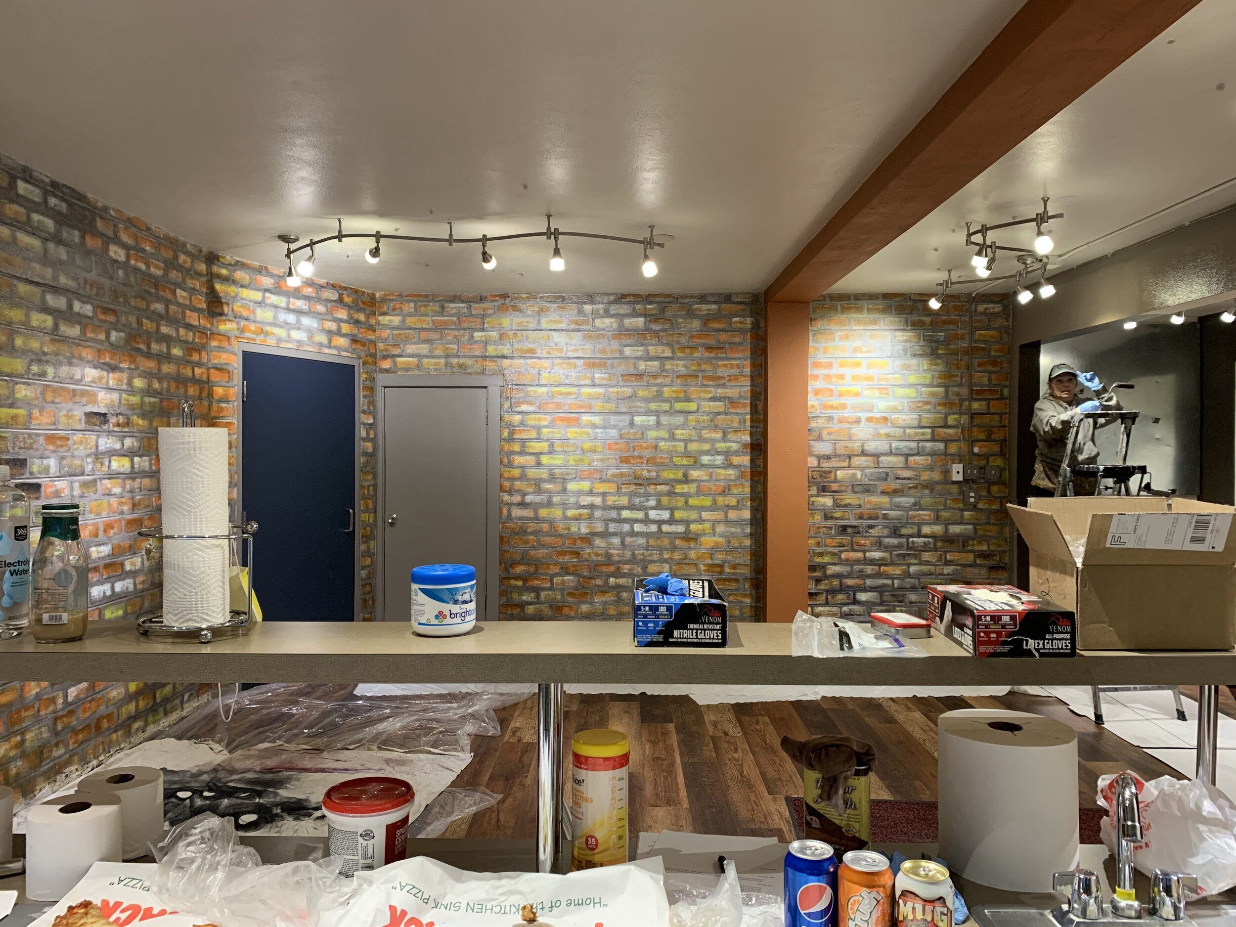
Judy-Mom: On the closet door is a colorful tribute to Judy-Mom, a foundational member of the theater community who contributed years to Chicago Street Theatre. The vibrant swaths of color surrounding her were inspired by the painted backgrounds of show titles from the backstage doors of the Memorial Opera House.
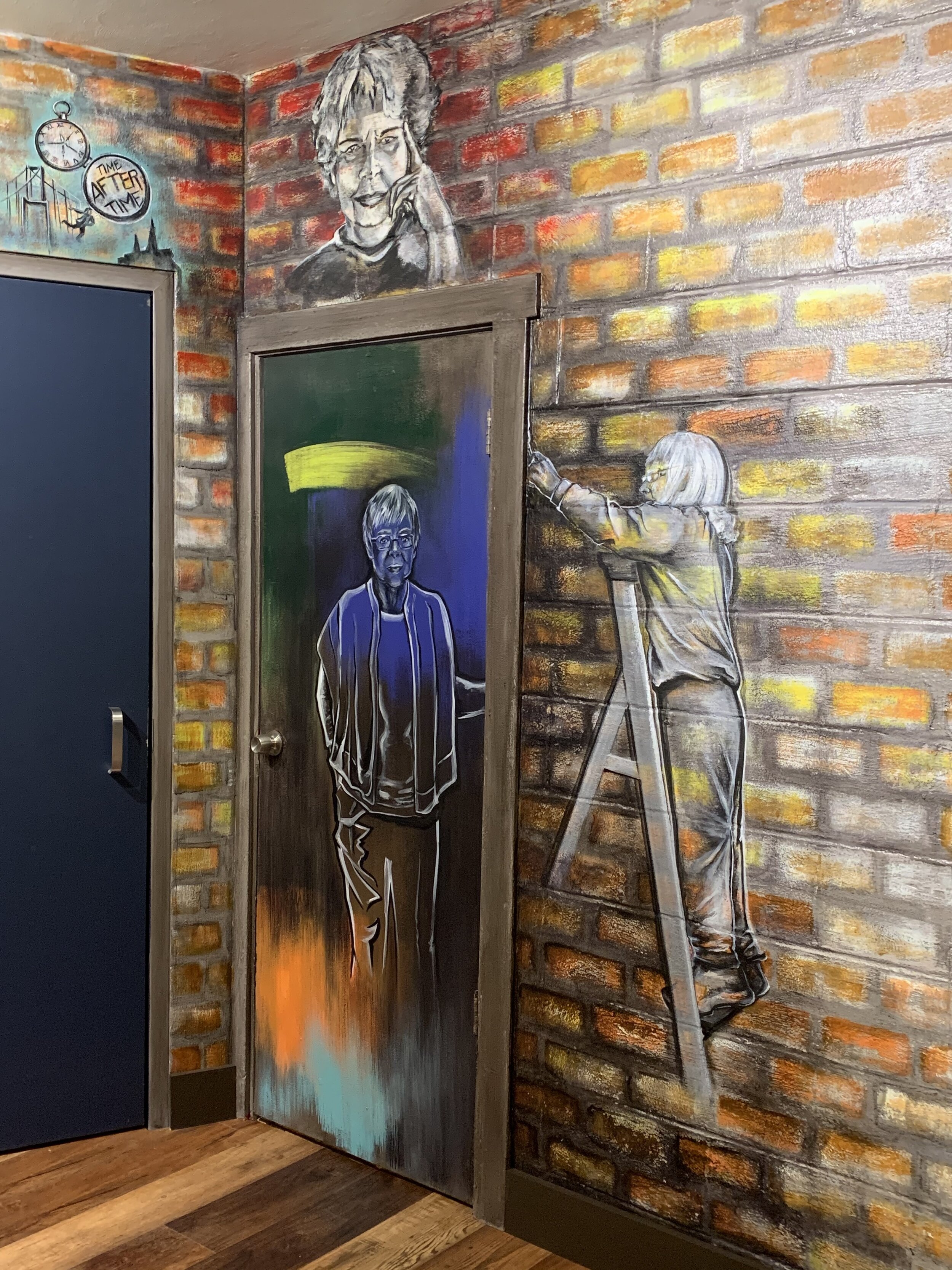
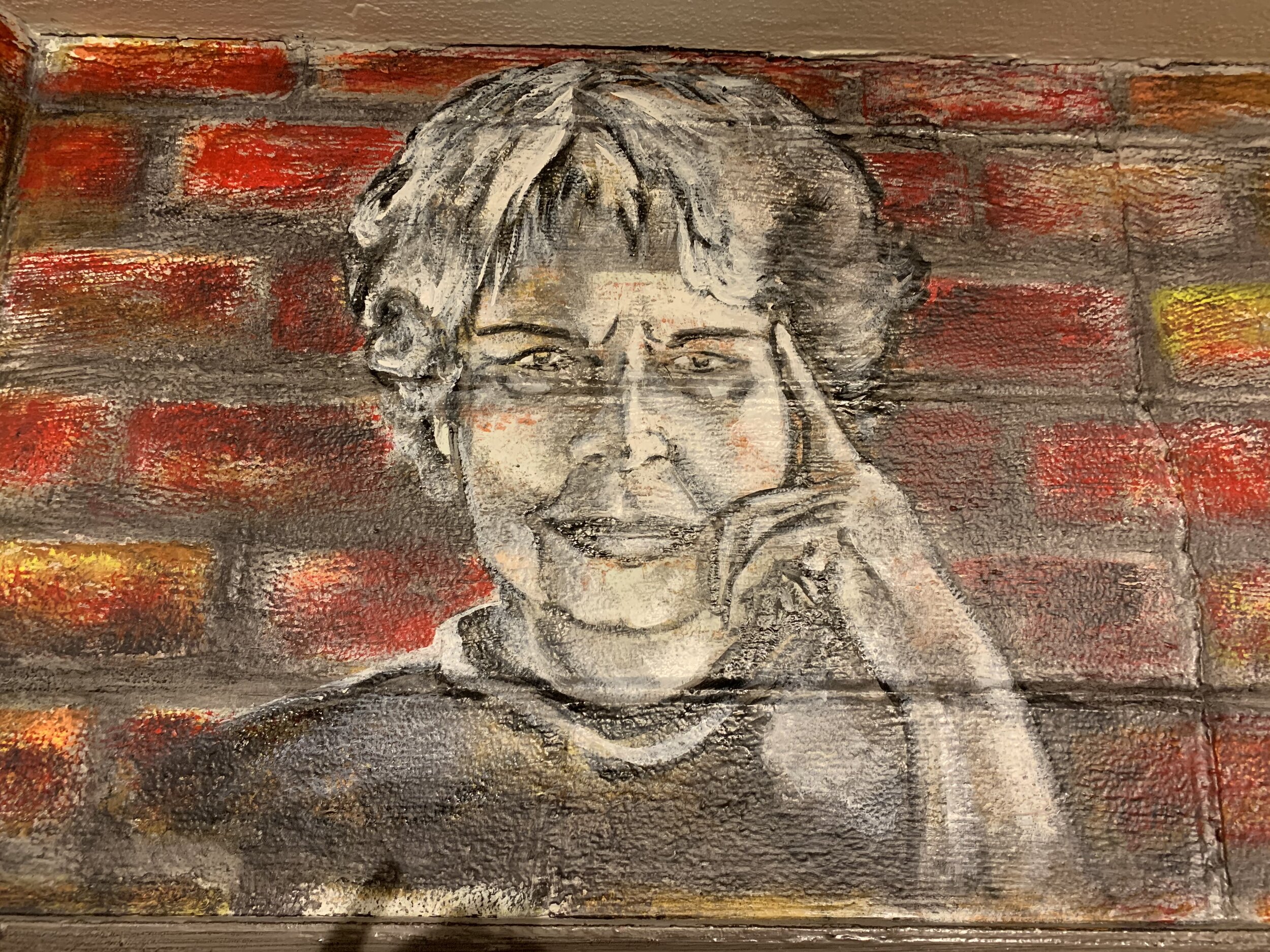
Edith B. Wood: Edie is positioned above the closet door, just to the right of the drama masks and theater entrance. The upstairs studio is named in her honor. Edie was a founding force of the Community Theatre Guild. She was instrumental in supporting the company to participate in the Glasgow International Theatre Festival in Scotland (1991). CTG won International Honors for Best Show, and Best Actor. I painted her from a black and white photograph with a striking red background, a portrait aesthetic that had been adapted to showcase theater members for some time.
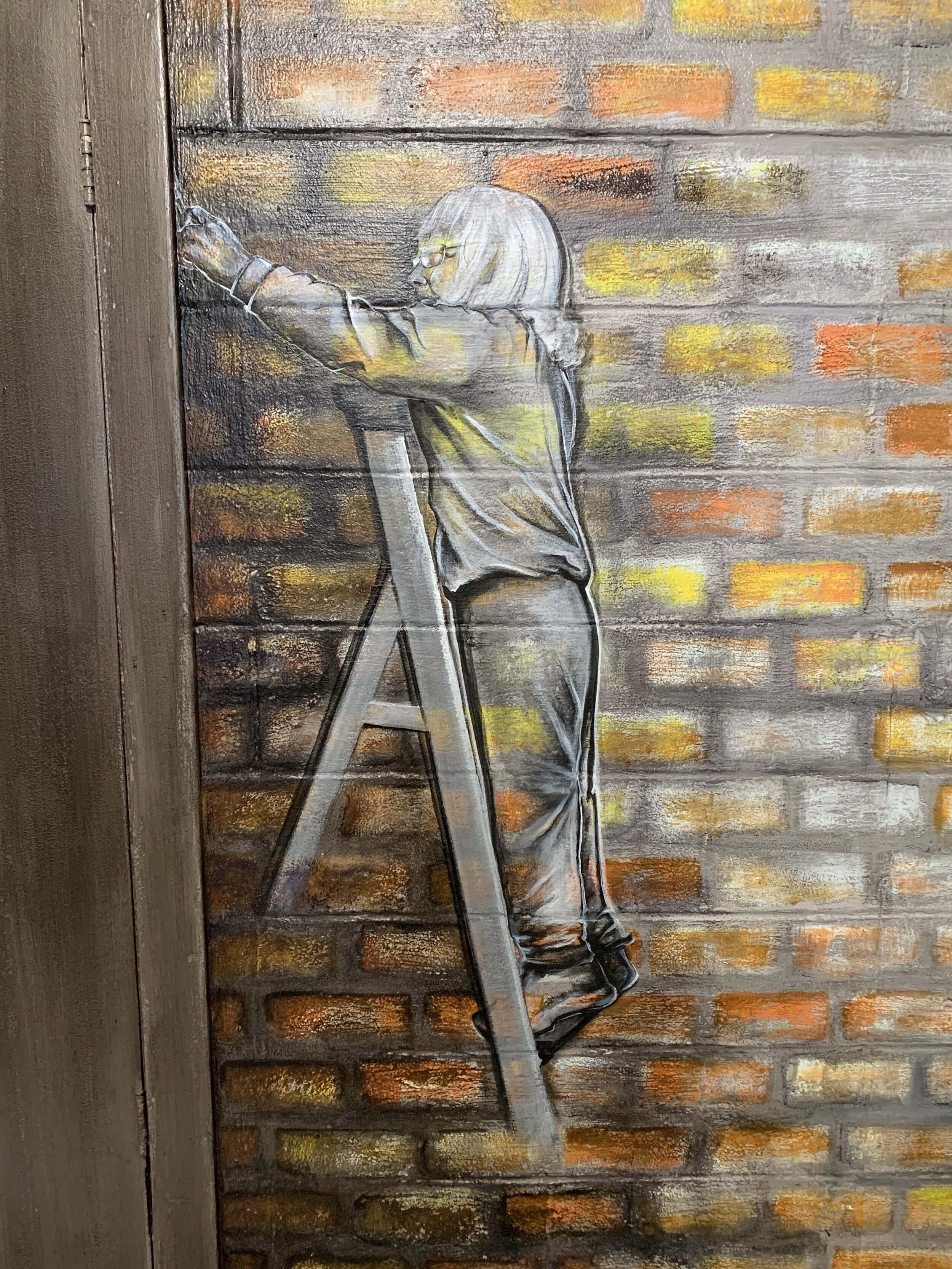
Marcia Burbage: This legendary woman is the theater’s historian, and has guided generations of volunteers in every aspect of production. She has been a member of the Community Theatre Guild/Chicago Street Theatre from the beginning. Her passion, dedication, and talent is an inspiration, and it is because of her effort that this mural was possible.
I chose to paint her in her element, working on a project. In this mural, Marcia is painting on a ladder, facing the closet door and theater entrance. Marcia and Mel are the bookends of this mural, and support the entire design. The dedication and passion of the people who make theater are why it can exist.


Anecdotes from Along the Way
Not everything in this project came through clearly. In fact, moments of spontaneity, humor, conflict, and confusion shaped what eventually became the best parts of the mural. Many of these ideas arrived in the final days before the reveal. Because the scope of this was so involved, I found myself diving into specific aspects of detail and staying there for longer than I had planned.
A Tale of Two Buildings
A great example of this was the large-scale rendering of the two theater buildings in perspective. I was drawing skewed, tapering angles that receded into space against a flat grid of concrete block. One building had arches, the other a jagged roof. I was trying to layer them as though they were spray-painted stencils that had faded. It was a lot to hold in my imagination, but as I moved through I could see it more clearly. Working in ink really saved me here, as I was able to fade and adjust the lines if needed. Also, stepping back routinely to check the accuracy was essential!
Lettering for Days
This project may just win for the most lettering I’ve rendered in a single place. The amount of text felt endless, but it also became increasingly second-nature as I moved forward. I also began to discover parallels between the styles of letters used in logos throughout the years. To help the lettering pop from the wall, I would paint the base in opaque ink, then overlay gloss enamel, and finally, lighten or darken the background. I used vine charcoal to lightly mark registration points, and free handed all the lettering from my reference images. The title on the AC Unit required the most layers, to solidify the bright yellow text against the dark blue background.
Speaking of that AC Unit…
I learned about brush-on plastic primer over the course of this experiment. I knew that I wanted to avoid spray primer, especially with the new floor installed. After a little research, I found that Rustoleum made a brush-on plastic primer, but it was unavailable at the local Menards. After a couple weeks of waiting, a shipment came into a nearby store and I picked it up. The smell of this paint--I mean, wow, holy fumes! To make painting the AC unit a possibility, I had no choice but to use this stuff first. I went in during the early dark of the morning, strapped on my respirator, and rolled a couple of coats. But the time the sun fully rose, I had fans running and locked the building behind me for a walk to the coffee shop. The results of this product were excellent, though I would highly recommend leaving the premises while it dries. I was able to apply a flat base coat over the dried primer, and later a water-based blue enamel. The final step for the awning portion was toning the brightness with a dark blue glaze. I didn’t want to cover the labels on the underside of the unit, so I compromised by mixing a thin gray glaze to shade down the bright white.
Patina Illusions
The copper patina I painted on the long overarching beam and elbow pipes was a fun process. I based these areas in a rust orange, before applying a solid coat of water-based bronze metallic. The orange base helps mask the translucency that most metallic paints have. From this base color, I added a dark, thin black glaze to the edges to create variety in the sheen. The next step was the patina green, which I stippled on and dabbed off in spots with a sea sponge. I always have better luck using sponges as a reductive tool that removes and lifts the paint. Then, I applied a full seal over the treatment with semi gloss polycrylic. The final step was the oil-based copper metallic, patchy highlights applied with a brush and feathered into the background colors. I did add a little toning with the black glaze to darken edges, but then it was finished.


Marcia in the Moment
One day while I was painting, Marcia came in to help Dona with other work in the lobby. She helped paint the wall opposite the mural, which (unbeknownst to her) would soon become a tribute to all of Chicago Street Theatre’s volunteers, dedicated in her honor. While Marcia was edging the door in a dark gray color, I asked if I could take her photo. She let me know that I could, and I took pictures that became my references for painting her. The portrait I painted of Marcia captures her in a moment where she was volunteering, painting a wall that would honor her legacy as a leader in the theater community. Ironically, I finished her portrait within the same morning of them installing signage for her wall.
The Debacle of “ER”
We were nearing our deadline to complete the remodel, and progress was going well. I had most of the major icons painted in, and was moving on to final details. Dona had painted new baseboards, which were scheduled to be installed within the day. We were on task, nearing the finish line. And then, a disruption flared…
Dona received a text message from a long-standing member who was distraught from the spelling of “ER” on the sign reading, “Community Theater Guild.” She had insisted to Dona that I change the painting in the mural, and switch the letters around. My instant gut reaction was total surprise, because I had followed the archival photos to the letter and didn’t know how I had mixed up a spelling. I had been so careful, I thought. Well--as it turns out, the fact that I followed the photos to the letter was exactly the problem. Dona explained that, apparently, their sign was the mistake—with switching the letters in “Theater” from “RE” to “ER.” Mel had built and hung the sign, spelled “Theater” with an “ER,” and decided to leave it for years. Older members were deeply bothered by this, as the correct spelling of the company name was ‘Community Theatre Guild.’
When I was reviewing the historical archives, I noticed the spelling discrepancy, but figured they had changed it when they updated their company name to ‘Chicago Street Theatre’ after the big location shift. I honestly didn’t think much of it, and followed the original photos as my references. I found it humorous that Mel had built and hung that sign alongside leading most of the construction in the building, and never got back around to switching the letters. It seemed like this was a battle of wills, as any of the other members could have switched “R” with “E,” but wanted Mel to complete this specific task. The fact that it remained unchanged for a near decade is how this, from my perspective, became a fascinating part of their history.
Later that evening, I had an unexpected opportunity to hear the first hand account of this debacle. Two of the longest-standing members stopped into the building, and told me the story from their perspective. From their account, Mel was not a fan of changing their name from ‘Community Theatre Guild’ to ‘Chicago Street Theatre.’ He had been with the company for years, and wanted to keep their name-identity the same. It seems like, from their telling of it, the sign was Mel’s way of protesting the change. One of these members had gone to the same university as Edie Wood, who had been a major founder and pillar of the theater community. They shared their memories and stories of her, and made the point that she absolutely detested the spelling of theater with “er.” In their education, “Theater” was the physical place, and “Theatre” was the art form. Ultimately, both are valid, and I have witnessed several interesting debates over the years regarding this difference in spelling philosophy. But ultimately, I appreciated their side of things, and was grateful to learn more about Edie’s legacy. They printed and gave me a picture of her, which is what I worked from to create her portrait. Her pensive pose and piercing eyes inspire us all to think. Her placement in the mural is far opposite Mel and his sign, where she can comfortably judge and forever scorn the incorrect spelling of “theatre.”
This tribute to Edie was one of the final additions to the mural, and has become one of my favorite memories from working on it. Every theater community has conflict with the camaraderie, and this is all a part of what comprises the energy of a place. As I often catch myself saying, “It’s always something…”

From Jessie, With Love
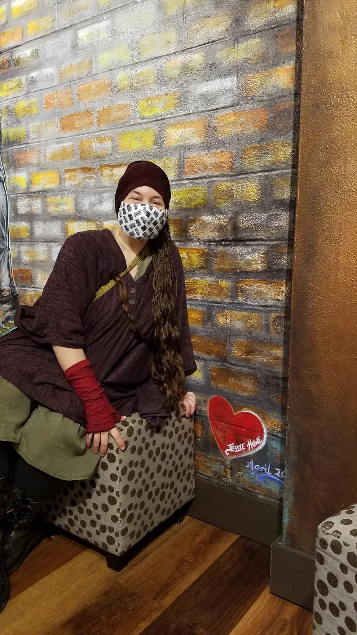
Dona is very aware that I often don’t sign my work, and in many cases, was not able to. When I’d create backdrops and elaborately painted floors for shows across Chicago, those pieces were not my own to sign. They belonged to the production. But, with this mural, she insisted that I sign it. I really appreciated that she wanted me to. Because this isn’t something I did often, I had to think about my signature and what I wanted it to look like.
In the photos of the back wall from the Memorial Opera House, someone had painted a simple red heart. It was the sweetest thing, a bright gesture against a sea of show titles. I decided that it needed to be in the mural, and it seemed like the perfect place to sign. On my final day in the space, I legibly signed my name in white along the curve of the red heart. I also thought to add the month and year--completed in April, 2021. Upon writing this, I suddenly felt like I had become a part of the history I had just painted.
Space to Grow
The expanse of wall that extends past Marcia, opposite the concession area, is simply painted brick. The idea of this was to allow breathing space in the design, and make the statement that there is always room to grow. If the flow of the mural begins on the left and sweeps to the right, then the expanse of brick would be the open path of the future. An aged brick wall, full of stories, standing ready to receive more.

The expanse to the right of the theater entrance. Chicago Street Theatre Mural (Lobby)
Connection
Being chosen to design and paint this project was an honor, especially because Chicago Street Theatre was my first true theater home as an actor and scenic artist. The absolute characters and genius creativity I have encountered in this community is remarkable. Many opportunities began within these walls, as my involvement here was a formative experience that inspired what became my career. Across the many stages where my professional life has guided me, my appreciation continues to grow for roots and the feeling of home. This is the first project of this kind that I’ve completed since the pandemic hit last year, and I couldn’t imagine a better one to return with.
This mural is a fascinating intersection between the old and the new, for me as an artist. It draws from everything I’ve learned through my experiences in scenic art, and elevates that with the passion I have for illustration. It’s a kind of culmination, of life experience and all the things I’ve learned. As I chart this new path forward through origination and entrepreneurship, I realize that I have found a new beginning in a familiar space. I am beyond proud to have given something meaningful to the home that supported me in the earliest steps of my artist journey.
Moments from Opening Night, and the completed mural


This mural is located in the lobby of Chicago Street Theatre, in Valparaiso, Indiana.
All featured artwork, design, and photography of this mural are by Jessie Howe.
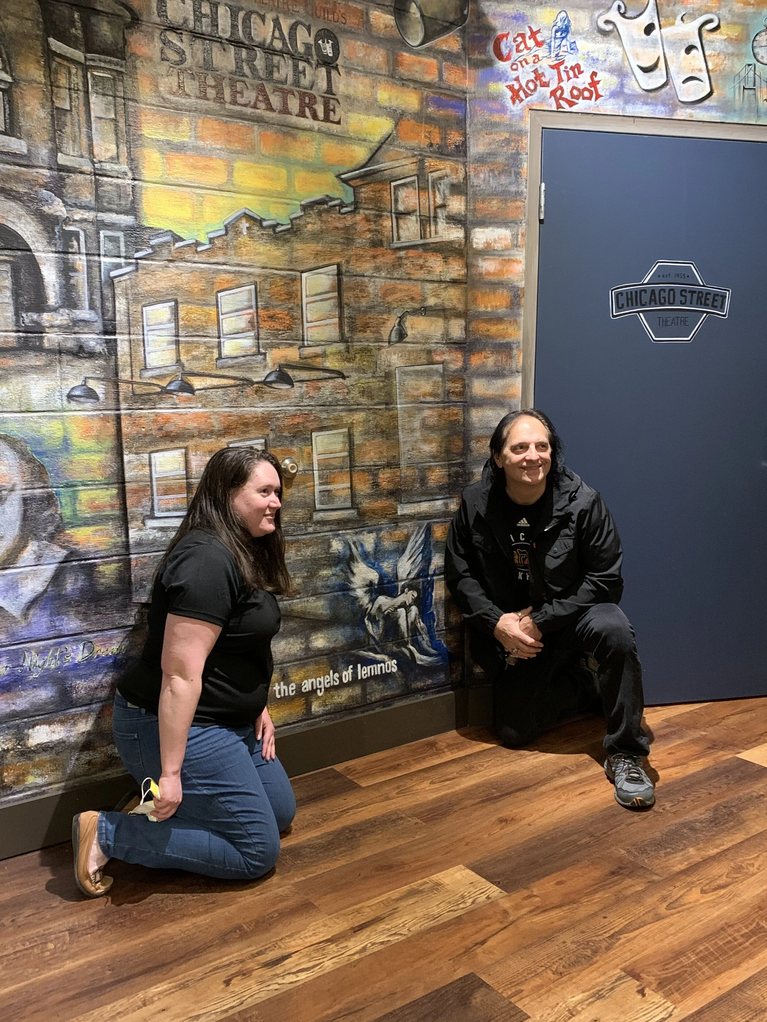
Professional Actress and CST Member Sarah recorded a video of the opening night lobby reception! Here, a beautiful wall was dedicated in Marcia’s name to honor the hundreds of volunteers who have made theater possible across the company’s 66 year history.
Have you ever experienced a show at Chicago Street Theatre, on or off stage?
Feel free to share in the comments below!

Do you love to Create?
Head over to our Art Section, to check out the latest in projects from the studio and abroad!
We feature original creations in our Shop, as well as music, collectibles, paintings, and beyond. Please Contact me by email for inquiries about commissions and collaborative projects, I would love to hear from you!